Toribash
Wow went from epic posts about it to stuff saying it not good lol. But I dont know much about art but i dont really like it
A VERY WISE MAN SAID TO ME IF YOU TRY HARD IN LIFE YOU WILL ACHIEVE GREAT THINGS, I LAUGHED AT HIM AND LEFT
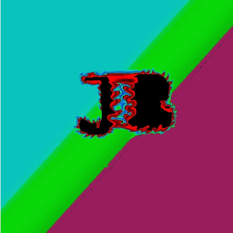
I didnt anderstand why the first ones to comment evaluate you as a 9 or a 8, for me is a 3/10 because the only thing that you did was smudges, easy and simple...
Maybe you can add much more effects...
UNIBASH
If you are trying to make a "logo". Avoid unnecessary effects. Logos should be simplistic to look at, because they are intended to explain a good deal about what they represent.. just from a simple glance.

"Effects", as many seem to push, is not the way to go for a logo. That rout would be just, graphic design.


As a logo, what you have now, I rate a 1/10. reason being, because there doesn't really seem to have a goal in mind for representing anything about what the logo is intended for. It just feels like an experiment with tools and effects, nothing more.

When making a logo, consider what you want people to think of the organization/group/business/person. Your color choice and design should be based on that. A true logo in general would have very very little "effects", if any.

As graphic art/design with what you have now 2/10. it just doesn't seem appealing. I still wouldn't focus on an overdose of effects like people are suggesting, even if it is a graphic art piece. Where it stands you will just end up with a large mess if you pile more on it.

When you do an effect for graphic design, there should be reason behind it. Don't add drop shadow just to add drop shadow, don't make it appear to be reflective just make it appear reflective, don't add filters just to add filters, and don't smudge just to smudge. You need to consider how an effect will impact the design and if it is truly for the better.
Last edited by lancer_c; Nov 25, 2009 at 06:38 AM.
Originally Posted by JesseBean View Post
i like the psychedelic look, it's really trippy. it explains me, jesse bean , JB

It is impossible to tell if it is a "JB" anymore.