Way to many "height" to be honest.
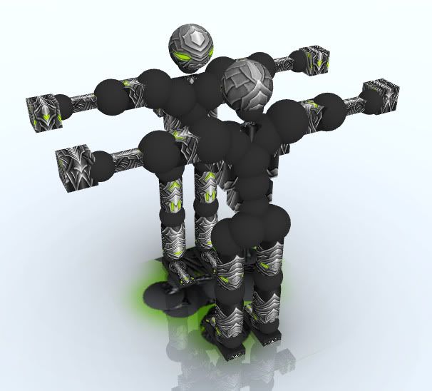
Looks like all the things are pasted together.
I think you should make a connection on WHY all those armored plates are there.
It looks random in my eyes.
Now about HOW you made it, it seems you know how to make depth, and that looks good.
But I think the gradients you put over almost every part (Yes I watched your tutorial, good work on that ;))
are a tad to much.
Overall I think its worth a 7.0
Fr3styL . Improving by Improvising
I'm an artist.
I'm an artist.
Originally Posted by AlphasoniK

Way to many "height" to be honest.
Looks like all the things are pasted together.
I think you should make a connection on WHY all those armored plates are there.
It looks random in my eyes.
Now about HOW you made it, it seems you know how to make depth, and that looks good.
But I think the gradients you put over almost every part (Yes I watched your tutorial, good work on that ;))
are a tad to much.
Overall I think its worth a 7.0
I understand your points. Maybe it's random, but it looks good for me. I don't want to think why the things are like this, I only try to make it cool. I understand why you don't like it. I want that when someone plays against me, and sees my textures, he'll be 'shocked' because of that contrast. Big contrast between black and white, gradients and lots of detail catches the wievers eyes.
Originally Posted by JesseBean
would someone mind telling me what a WIP is? sounds like im a newbie, and i am at least in art
WIP=Work In Progress
But hey, thanks for your comments everyone. Also thanks for critique, I'll think about that when I more textures.
Texturing tutorial
No requests please
No requests please