Last three are just awesome.
As everybody have said, you need to work on eyes especially.
As everybody have said, you need to work on eyes especially.
Originally Posted by JiBaiLanJiao

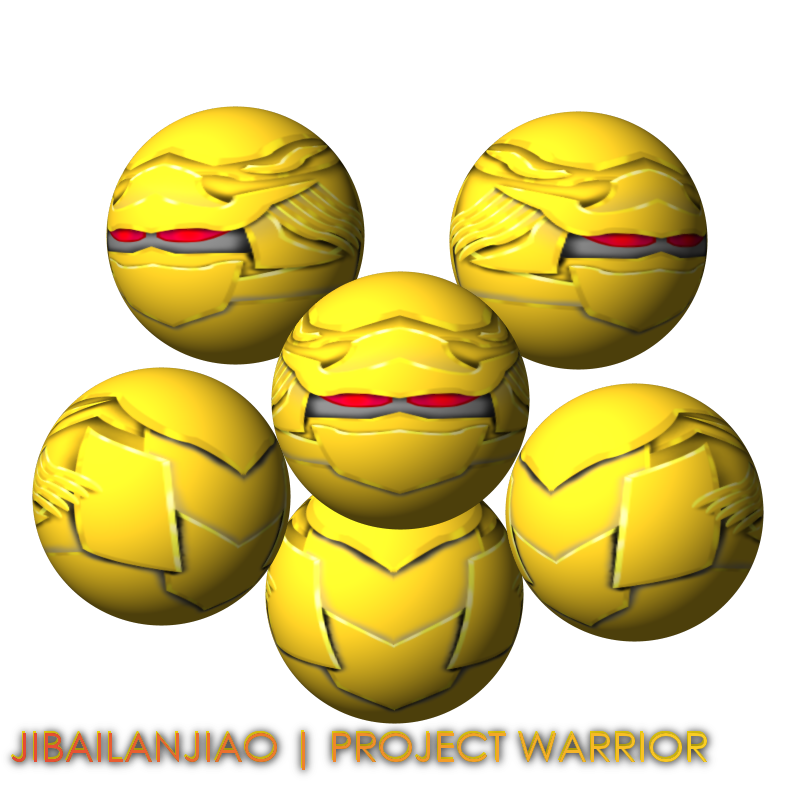
Forgot to replay to this,xD.I use GIMP,Photoshop is too expensive for me and mom won't buy it for me.Still learning to make the eyes,now my latest creation is Metal Sadness,I made something else instead of visors.I learnt the metal effect from Pate5(He didn't teach me,I learnt it myself).I don't save them into .PSD or .XCF,my dad told me: "Start it today,finish it today".You should check out Metal Sadness,it's kinda cool.
Your dad is wrong with that... some art requires more than 10 hours of work, which means you need to have a break.
learn how to draw eyes, study it's anatomy, see more pics of random eyes and you should be able to make them look good

I'm Tasty and I know it.
I like Rocks.
I like Rocks.
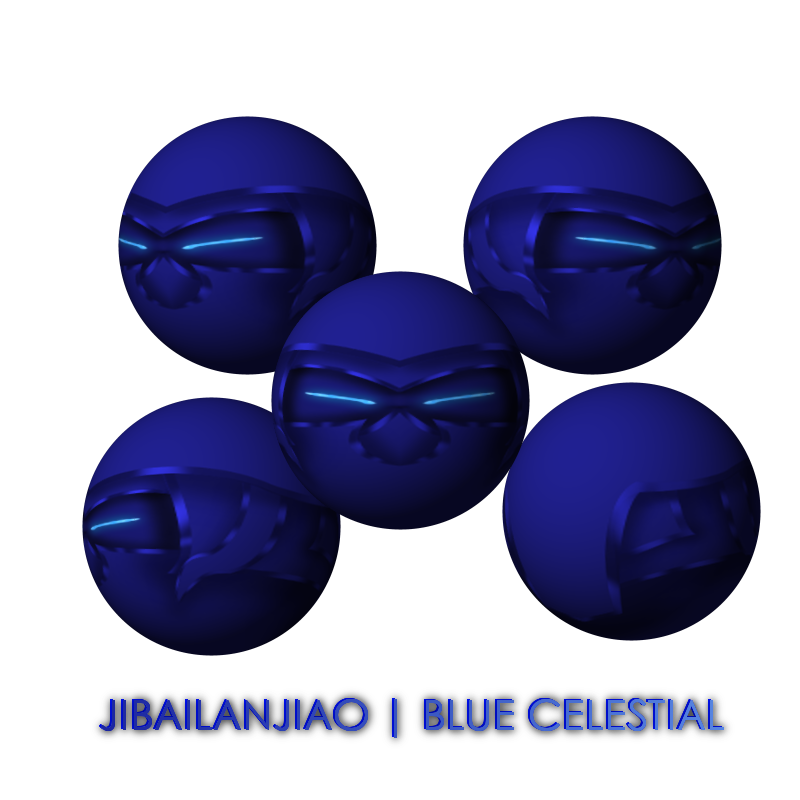
Working on a new project,this time I am using blue as my main color.But I don't know what color on the eyes should go with blue.Any suggestions?
-----
Finally!A new artwork with different colors than all the others.Using blue as main color.Used some Radioactive,Marine and Aqua on the eyes.C&C now!Oh yeah,I regret I sold my Metal Sadness for 27k,so sad...
-----
Finally!A new artwork with different colors than all the others.Using blue as main color.Used some Radioactive,Marine and Aqua on the eyes.C&C now!Oh yeah,I regret I sold my Metal Sadness for 27k,so sad...
Blue Celestial
Last edited by JiBaiLanJiao; Aug 27, 2011 at 01:38 PM.
Reason: <24 hour edit/bump
Don't use gradients for thr shading and highlight, and don't do it with a sharp selection, have you ever seen a robot that has an outline around every piece of it's head that at random times changes from black to white? It completely destroys the accuracy of the highlights and shading, the highlights and shading are to show where it's reflecting light and whether it's sort of poking out of going into the head.
Tint is sex.