


I used gimp 2.8 and a bamboo wacom tablet.
New update guys, took a lot of your cnc and changed stuff. Probably won't be changing much more unless it's minor.
New update guys, took a lot of your cnc and changed stuff. Probably won't be changing much more unless it's minor.
Wip3
3
Ready for color.
Done with this community, you guys suck.
Originally Posted by jusmi

I used gimp 2.8 and a bamboo wacom tablet.
New update guys, took a lot of your cnc and changed stuff. Probably won't be changing much more unless it's minor.
Could you tell me how much You much the tablet costs ?
Also Great work cant wait to see this finished and colored.
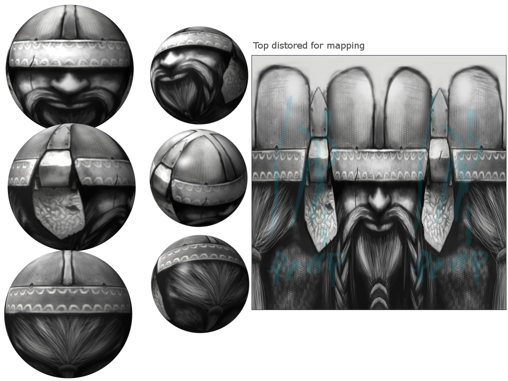
This is a very nice piece of art. What I would do to improve it is only in mapping.
As is often the case, this piece looks better flat than on the sphere. It is the challenge we face as artists, and it is not easy, but the fact is in order for your head to look proportional in-game, it'll have to look funny when its flat. So here it is, the face would have to be narrower, because the middle gets stretched quite a bit. I would also raise everything slightly, because we lose so much beautiful stash and beard detail at the bottom. The metal earpieces over the ears could also be a bit narrower.
You have a lot of talent, and this is a wonderful piece. This is of a high level quality.
9/10 from me. I will come back because I want to see the end product, this is going to be a very nice head.
rock the world, one fight at a time