


The eyes feel too far up on the head to me - that combined with the height of the purple "chin" really throws off the head. In general the hands are quite good but the highlights on the fingers on the bottoms of the hands (i.e. viewed from the front) seem a bit inconsistent. That's not to say they should all be identical but the pinky finger in particular looks completely different from the others.
"i wish i could do that ken watanabe face where his eyes are really wide" -siku 2015
DONSELUKE, MASTER OF LAWSUIT
if you love america please sign this petition
B&B&B&
who likes outlines? and yea i am going to fix the head later as i go up from the legs
-----
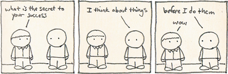
I'm taking a break from this project I'm going to make a cool cartoon set ill continue with this later
-----
I'm taking a break from this project I'm going to make a cool cartoon set ill continue with this later
Last edited by Nut3llaNinja; Apr 16, 2014 at 10:06 PM.
Reason: <24 hour edit/bump
Every body praise this man
Rumour is my bae for lyf
Rumour is my bae for lyf