


I get it what you mean. It's like that "drop shadow" effect in photoshop, you get that "noob" feel about me? haha
I kind of thought it wouldn't be like that when I made it, thought it looked really nice even thought I used a simple effect. I could've made it differently, taking a picture of a real brush stroke and use that in the same matter... Wouldn't make much of a difference.
Either ways, thanks guys! Your critique is good even though it feels a bit hard.
I've made your buttons Alpha, removed the donation button (careless thinking) and I'm working on a new logo.
Your opinion doesn't really matter on that. The idea was mine yes, the saw was actually based on a real saw. The customer wanted it as you see it, I gave him several options to chose from and he wanted the saw, with some edits. I can't do whatever I want when I make a logo for someone, it's their choice, but of course, I can influence their decision with my knowledge.
Ps. This is about my site in general, not the individual content. Neither was your "critique" really helpful :/ Thanks for trying though.
I kind of thought it wouldn't be like that when I made it, thought it looked really nice even thought I used a simple effect. I could've made it differently, taking a picture of a real brush stroke and use that in the same matter... Wouldn't make much of a difference.
Either ways, thanks guys! Your critique is good even though it feels a bit hard.
I've made your buttons Alpha, removed the donation button (careless thinking) and I'm working on a new logo.
Originally Posted by Freelancer

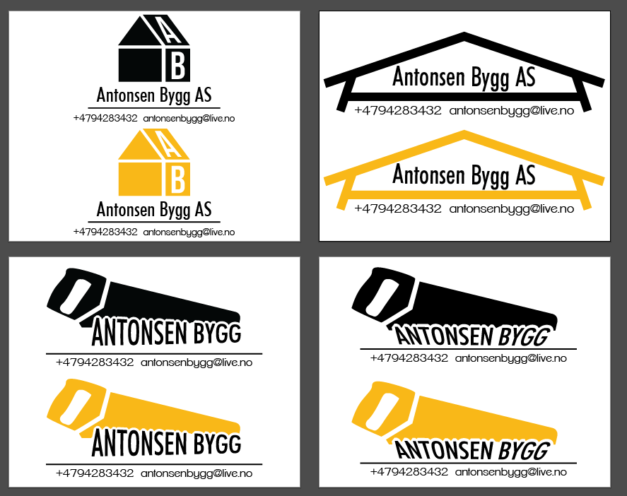
I expected more from you Fenris. Everything in this screams amature.
I get extra annoyed by the saw logo - as you had an idea that the words would be part of the saw - but ruined it completely by not looking at a real saw. Everything about the saw is really badly made. Same with the rest, I remember that owl love tree - but back then it didn't have that ugly stroke and all that... why?
Your opinion doesn't really matter on that. The idea was mine yes, the saw was actually based on a real saw. The customer wanted it as you see it, I gave him several options to chose from and he wanted the saw, with some edits. I can't do whatever I want when I make a logo for someone, it's their choice, but of course, I can influence their decision with my knowledge.
Options.
Ps. This is about my site in general, not the individual content. Neither was your "critique" really helpful :/ Thanks for trying though.
Last edited by Fenris; Jul 21, 2014 at 06:06 PM.
No it's their choice, but your choice to choose quality.
Jalis: Freelancer, you're a duck | Sachi: Freelancer, you're a duck | Reanimator: Freelancer, you're a duck
satiknee: Freelancer, you're a duck | Wiggi: Freelancer, you're a duck | Tarlan: Freelancer, you're a duck
satiknee: Freelancer, you're a duck | Wiggi: Freelancer, you're a duck | Tarlan: Freelancer, you're a duck
Way more logical this way.
Even though I would've made the buttons a bit less prominent.
You know why I'm giving harsh criticism, I've always done that and you've improved.
It's just to help you, Fenris.
Right now, if I go back after clicking one of the three buttons, I don't go back to those, but a different screen.
A screen I kinda like more.
Be sure that there's unity between the logo-like buttons on the homepage and the screen you go to after.
Right now there's not a lot of unity which makes it look a bit messy.
The rounded dropdown menu is a design-clash, as well. The rest is all hard and sharp.
Same with the back arrow, go for simplicity instead of a almost plectrum-like design.
You've probably got a lot of ideas about your website and that's hard to cope with.
Try to be true to the basics some more and sketch it out, don't just work in code.
Treat the website like a design and you'll end up with a well-designed website.
Will keep an eye on your progress, see if I can give you some more tips.
Fr3styL . Improving by Improvising
I'm an artist.
I'm an artist.
Not much wrong with your critique, but Freelancer's always been somewhat offensive.
Will give it some work, I agree with you. It's still a WIP, and I'm very eager.. Heh, the sketch thing isn't exactly my thing. I ponder a lot...
Will give it some work, I agree with you. It's still a WIP, and I'm very eager.. Heh, the sketch thing isn't exactly my thing. I ponder a lot...

