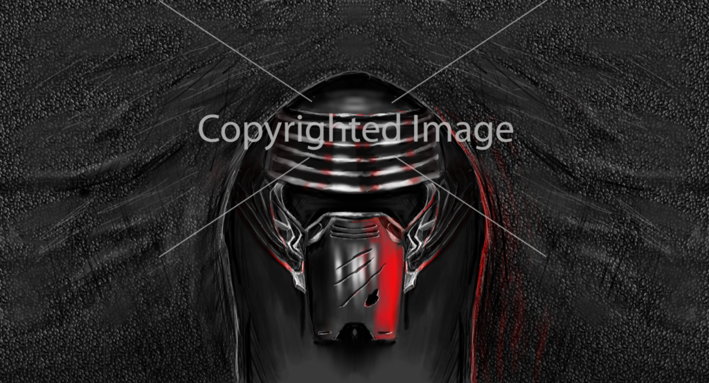
is it alright if I mess with this head?
not gonna sell or anything, I would like to blend it a bit n stuff
:c
to help my art get better
not gonna sell or anything, I would like to blend it a bit n stuff
:c
to help my art get better
[SIGPIC][/SIGPIC]
| Nomad Moderated Message: |
| Be more straightforward with your uplifting messages or I'll fucking skin you alive. |
...because that went really well the last time you did it.
But yeah, nice work! It was pretty cool seeing a star wars head~ Like Deuteria pointed out though, the back is a bit dull :< Don't feel like you need to be boxed in by staying true exactly to how he looks in the movie. Feel free to add your own personal embellishments to make it your own.
Other than that, you've improved a hell of a lot in the past few weeks. Really looking forward to your continued growth
is it alright if I mess with this head?
not gonna sell or anything, I would like to blend it a bit n stuff
:c
to help my art get better
no
no
no
no
...because that went really well the last time you did it.
But yeah, nice work! It was pretty cool seeing a star wars head~ Like Deuteria pointed out though, the back is a bit dull :< Don't feel like you need to be boxed in by staying true exactly to how he looks in the movie. Feel free to add your own personal embellishments to make it your own.
Other than that, you've improved a hell of a lot in the past few weeks. Really looking forward to your continued growth
Yes! this is wip 1 Ill try to make it awesome in wip 2, Deuteria gave some great advice :v
Thanks for the encouragement, man c: really makes me wanna keep going


