

Original Post


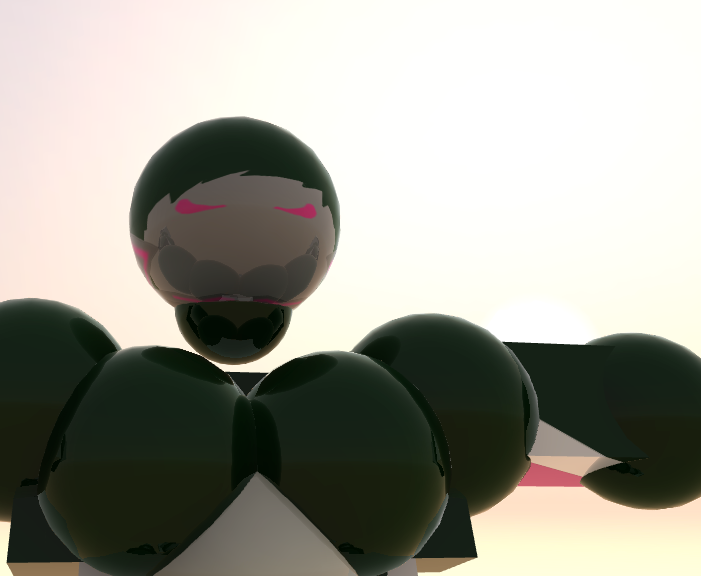
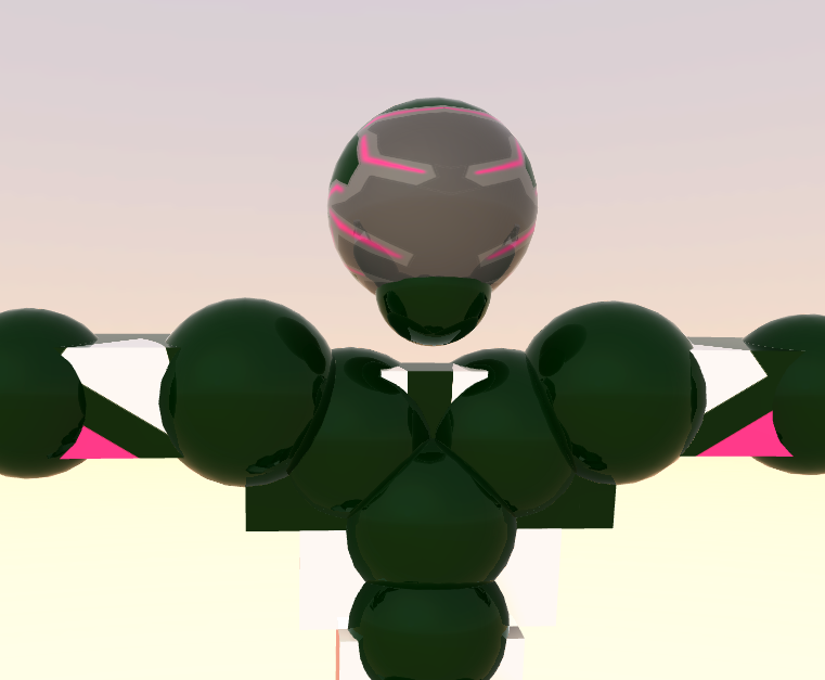
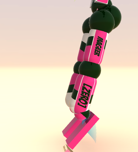
[Tex] Awesome Hunter texture
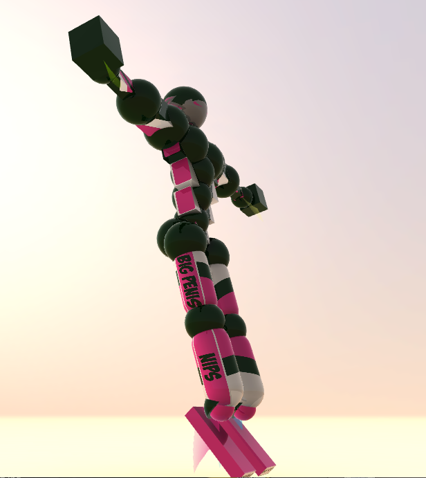
i made this set for one of my clan members, but he doesn't want it.
can i please have some feedback and maybe what price it would sell for?
i can change the text on the body to whatever.
can i please have some feedback and maybe what price it would sell for?
i can change the text on the body to whatever.
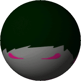
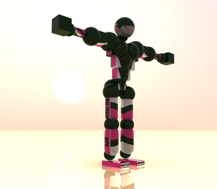
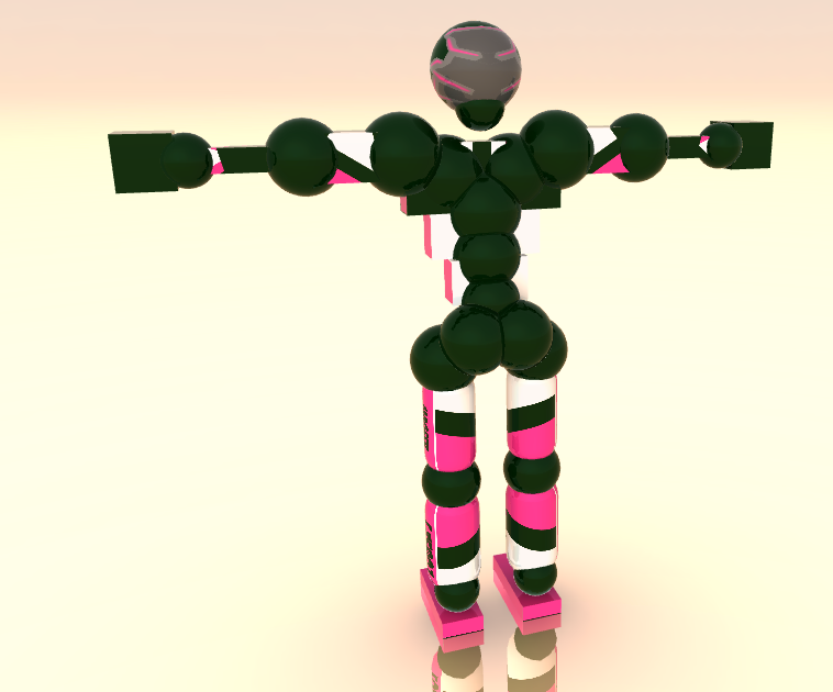
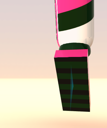
pictures of the set
Clan League 2013 & 2019 Champion
Praise BONDarenko
Praise BONDarenko
Originally Posted by Bird

Nice one, just don't add nothing let it remain how it's now,
9/10 but it's like made for someone, there is that feeling while you're looking on it
the person i offered it to didn't want it, so im planning on just selling this on the art textures thread

with the words on the legs replaced with what the buyer wants
Clan League 2013 & 2019 Champion
Praise BONDarenko
Praise BONDarenko
Seriously...
Don't you think that the colors look a bit... awful?
I mean, there sure are really underrated color combinations out there, but are you sure that this dark green and hot pink look good together? Not to mention the gray-ishness on the head, which makes everything even worse...
I mean, seriously, keep to a certain color scheme and use as less colors as possible. Then add some shading... If it's the style you want to keep it in. But be more consistent.
So, about the head... besides all of the aforementioned things you should improve on, the head is pretty generic. There's no much creativity put in it, nor do the colors match the set in general. For example, why did you make the "skin" color gray? It would fit much better if you'd let it be white. And that dark gray part on the back... Why? ._.
As much as I understand, you've put it there just for the sake of detail without really thinking it through.
Also, the eyes should be emphasised more. Their pinkyness is not enough. And they don't look all that agressive and/or dynamic(I'll cover that pretty soon).
Now, let's start examining the rest of the set, shall we?
To be honest, I must admit that you've done a decent job drawing the upper body. The biceps and triceps look quite good (well.. besides the colors). And the torso is quite decent aswell... Even though it's the same texture pasted over again.
But, unfortunately, as we go lower, so does the quality. The legs are really "static " they don't go with the arms really well. Oh, and the set doesn't feel all that dynamic in general. The lines are too solid, not "edgy" enough. Especially on the legs (which on most occasions are the ones that hit the opponent, hence more attention is drawn to them... which means that you have to put extra effort in making them look good enough and somewhat fearsome).
Also, the texts don't look good at all. They're just plain... text... nothing more... big penis, lol
So, yeah... There's still quite a lot of job to do. And to be completely honest, I wouldn't buy that... Hell, I wouldn't even take it for free ._.
Either way, I'd say that 2k-5k tc would be enough for such a set.
tl;dr
Needs more shading and detail.
art board mods: if they dont understand it its not cnc
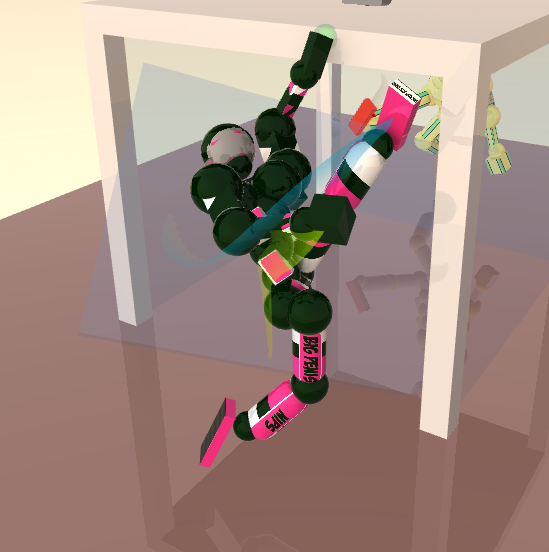
 it is easy enough to recolour though. i made the head to white now too, it looks better.