

Original Post


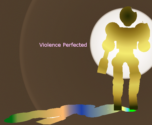
[IMG] My new avatar!
Is this an ok avatar? If not, tell me and I'll try to make something else.

:I So freaking low quality that it hurts.
Basicaly just gradients turned all over the tori & shadow.
Very bad, also try to do the avatar MAX 200x200, bigger will lose fuckload of quality.
1/10
 Sorry,but...it's really bad...
Basicaly just gradients turned all over the tori & shadow.
Very bad, also try to do the avatar MAX 200x200, bigger will lose fuckload of quality.
1/10
Sorry,but...it's really bad...
Centuries Of Damn
Lol, thanks anyway. My first time useing gimp. D:
EDIT:At least some one did tell me it sucks lol
EDIT:At least some one did tell me it sucks lol