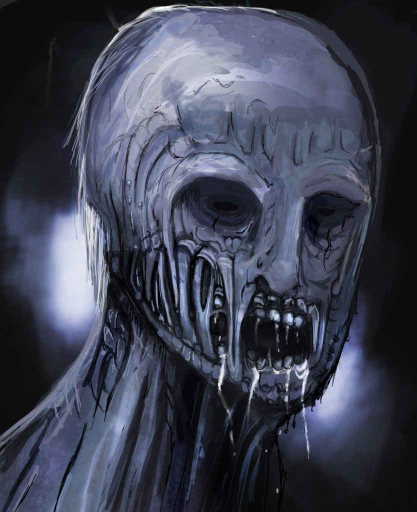
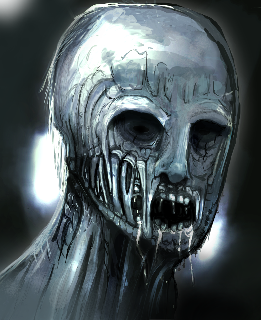
looks good but i guess a few scratches on the head wont hurt the top of head looks too bold and empty to me
p.s./offtopic: i really dont know y u need others to make u a concert poster u should manage fine on urself, seeing u can make such good quality art