Original Post
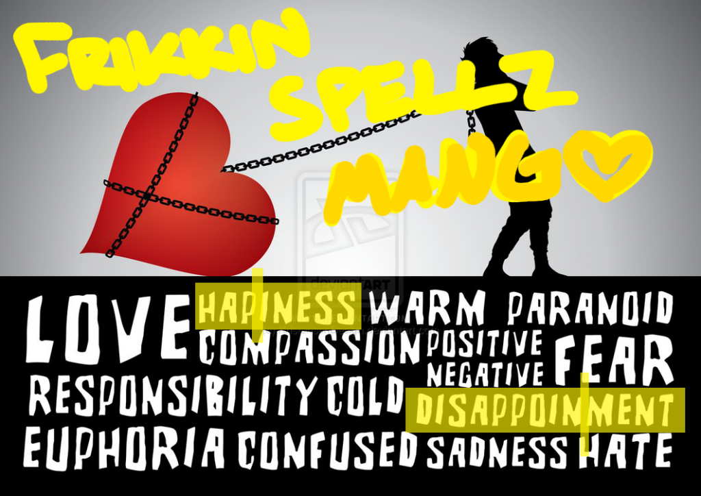
[Art] Draggin on a huge heart...
Hi, so here's my newest illustration. Didn't sleep all night making this, couldn't sleep.
Deviantart Info
Tools used: Adobe Illustrator
Font: Brutality Extra
Model: Me
Huge
Deviantart Info
Tools used: Adobe Illustrator
Font: Brutality Extra
Model: Me
you need to stop with the radial gradients, they are really really really really lazy
also, i think you need to ease up on the massive amounts of angst
what are you, 25? and you're still posting "i'm so deep :^(" pieces to your deviantart
try something new and original, then come back
also i recommend tumblr instead of deviantart, because there's a whole lot less pornographic sonic fanart on tumblr and the community is generally not terrible
now granted, what you've done here is pretty well-done for what it is
for the model, did you trace the shapes or use it as a reference?
Last edited by boStaff; May 27, 2013 at 05:28 PM.
shmevin eats smegma
I don't entirely agree on the radial gradients.
If used properly they can be very handy.
Fenris just uses colours that are too far apart.
If he'd pick white as the centered colour and a very light grey as the outer colour it would've added to the piece instead of subtracting from it, like it is doing now.
I wouldn't suggest using gradients on the illustration itself as that will make it look very tacky very fast. Instead, use small streaks of a lighter colour to highlight what you want to highlight.
Here's an example I made a while back for a children's app:

I used gradients as well as the little highlights.
I hope this helps you out a bit.
If used properly they can be very handy.
Fenris just uses colours that are too far apart.
If he'd pick white as the centered colour and a very light grey as the outer colour it would've added to the piece instead of subtracting from it, like it is doing now.
I wouldn't suggest using gradients on the illustration itself as that will make it look very tacky very fast. Instead, use small streaks of a lighter colour to highlight what you want to highlight.
Here's an example I made a while back for a children's app:

I used gradients as well as the little highlights.
I hope this helps you out a bit.
Fr3styL . Improving by Improvising
I'm an artist.
I'm an artist.
bo: I don't think they're lazy at all... Also, I think they fit in pretty well on the few Illustration I have made so far. Would look rather...Boring, without it.
What does it matter? I am 18, 19 in a month. I'm not having problems with anxiety, I am having problems in general. There's been a lot of shit going on, but also a lot of good things. and I like to express it via art, either you like it or not.
Thanks! I basically traced a picture taken of myself, I'm not very good with character design, nor sketching.
~
Wesm: AGREE!! Probably will make the heart somewhat rock-like, and change the chain, make it more... damaged.
~
Alpha: The purpose of the gradient was to create high contrast between the background and the objects,
I wanted it to look somewhat hard because I wanted that dramatic feel.
Ps. I'm finding it hard to understand what you mean :/


