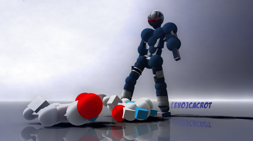
Top: It has some nice effects.
You got a very good shot on this one, but the colour that you chose adds no real feeling to it. It kind of makes it look dead.
6/10
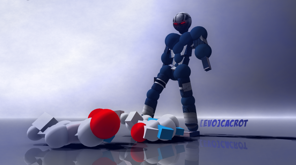
Middle: This one I like the most.
You got the best background for it, it has the right gloomy colour and the clouds just make it so much better.
And I love blue..
10/10
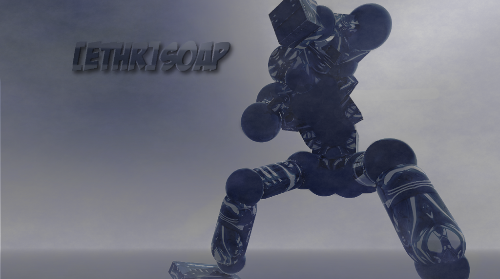
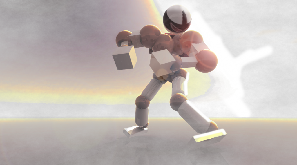
Bottom: This one is just lazy.
You have the naked relax joints, way too many effects and on the right leg, there just really bright white highlights, what is that? I don't really like it.
3.5/10
You got a very good shot on this one, but the colour that you chose adds no real feeling to it. It kind of makes it look dead.
6/10
Middle: This one I like the most.
You got the best background for it, it has the right gloomy colour and the clouds just make it so much better.
And I love blue..
10/10
Bottom: This one is just lazy.
You have the naked relax joints, way too many effects and on the right leg, there just really bright white highlights, what is that? I don't really like it.
3.5/10
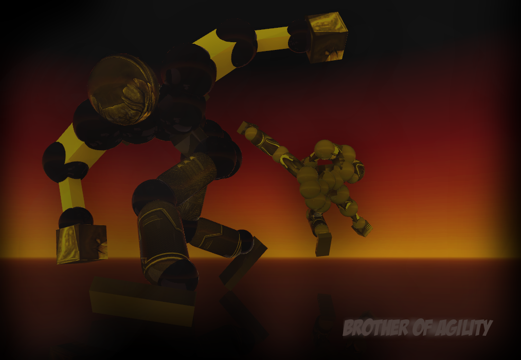
Talking about the second one, it is pretty good, for sure. But you might've not chosen a right pose in my opinion. He looks like he's about to fall down. Makes the whole image look 'unbalanced'. In addition, you can't see the details of that excellent set he has on because the hand is blocking the upper body. 6.5/10
Otherwise, agree with the comment above but the last image... meh, i'd give it a 6
Otherwise, agree with the comment above but the last image... meh, i'd give it a 6
[Gangsters] RuBash
А меня даже не вписал, хуисас~Tarlan
[TABD][Team Australia] RIP[Source]
КАРОЧ ТУТ ПИДАРЫ КАКИЕ ТО ТИПА ОФАНА ДОЛЖНЫ БЫТЬ НАПИСАНЫА меня даже не вписал, хуисас~Tarlan