

Original Post


[art] Second venom siggie.
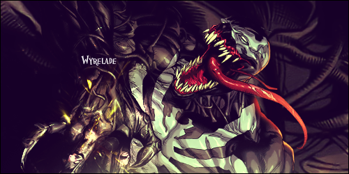
I tought I should try a new style on making sigs as you guys were telling me to try something else... This is what I came up with...
Tell me what you think this time.
Tell me what you think this time.
"B U R A K K U W A I T O A A M A A"
- B l a c k | W h i t e | A r m o r -
- B l a c k | W h i t e | A r m o r -
The light difference looks weird because its coming from the mysterious bottom of the sig.
Also the name looks pretty small and doesn't necessarily fit if you would. You did better with the background than last time because it was kind of dark. There are a few other problems of which I can't put my finger on.
Also the name looks pretty small and doesn't necessarily fit if you would. You did better with the background than last time because it was kind of dark. There are a few other problems of which I can't put my finger on.
Originally Posted by Tay

The light difference looks weird because its coming from the mysterious bottom of the sig.
Also the name looks pretty small and doesn't necessarily fit if you would. You did better with the background than last time because it was kind of dark. There are a few other problems of which I can't put my finger on.
I actually wanted the text to be tiny as possible..
there it is 14 pixels.. and I was about to make it 10 pixels.. but ye...
Also I tought I might not make my name at all on it.
"B U R A K K U W A I T O A A M A A"
- B l a c k | W h i t e | A r m o r -
- B l a c k | W h i t e | A r m o r -
glad you took our advice and stopped using your hideous glowing circles.
this one is a lot better, although the color looks a bit strange. not sure if i like it or not. you should try colder colors like blue or surgical green.
the text doesnt fit in, you should try putting it in a different spot or change the font, iunno. the background is pretty dark, and is very blurry. there's nothing that says you shouldn't use a different render completely for the BG
pennis and also dicke and balls