Original Post


[TEX]A WIP new set for myself
It's been a loooooooooooooong time since I did textures, but I got bored and decided to try my hand at making myself a new set at 512x512. I'll be sticking with the vertical mono-eye and general color scheme of my current set (and may simply upscale a few of the bits and pieces that I particularly liked) but the rest will be all new.
I've not bothered to link my reference images because I'm pulling elements from dozens of different ones. If you're curious where a particular element came from feel free to ask and I'll do my best to point you in the right direction.
Current state (V4 head, neck, partial arms and torso):


I've not bothered to link my reference images because I'm pulling elements from dozens of different ones. If you're curious where a particular element came from feel free to ask and I'll do my best to point you in the right direction.
Current state (V4 head, neck, partial arms and torso):
Archived progress


Originally Posted by hanz0

I use Photoshop. The pen tool is my best friend.
Last edited by Arthur; Apr 27, 2014 at 03:02 PM.
"i wish i could do that ken watanabe face where his eyes are really wide" -siku 2015
DONSELUKE, MASTER OF LAWSUIT
if you love america please sign this petition
B&B&B&
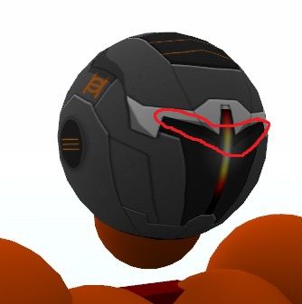
A vertical 'visor' instead of a typical horizontal one,
looks interesting!
But the glow effect you have going on, on the
visor/light looks like it blurs just a little bit too much.
looks interesting!
But the glow effect you have going on, on the
visor/light looks like it blurs just a little bit too much.
The past makes you wanna die out of regret, and future makes you depressed out of anxiety. So by elimination, the present is likely the happiest time.
When I first looked at your sketch, I thought it looked more like a gladiator's head. The long vertical lines in between the face looked like a nose, and the dark gap below looks like a mouth. Didn't know it would have ended up as a mono-eyed robot head tho. :O I like it, needs rune encryptions.
initial sketches: MEGATROOOOOOOON
the eye slits and the vertical mono eye conflict a bit, the eye slit isnt so noticable, but is noticable enough to confuse them with being actual eyes, leaving the vertical mono eye as a nose type thing.
with the eye slit there, it makes the front look too small, id just suggest you get rid of it.
and add some of those highlights to that light grey mantle bit, make it look slightly raised
-=Art is never finished, only abandoned=-