

Original Post


[IMG]Oyster's Latest
All my latest crap in chronological order of most to least recent.
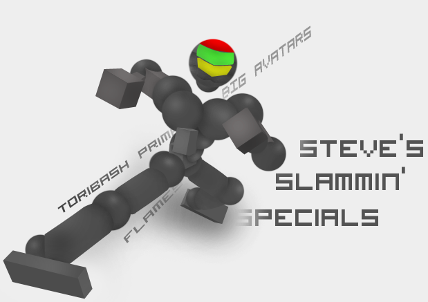
All pentool, dodge/burn and text.
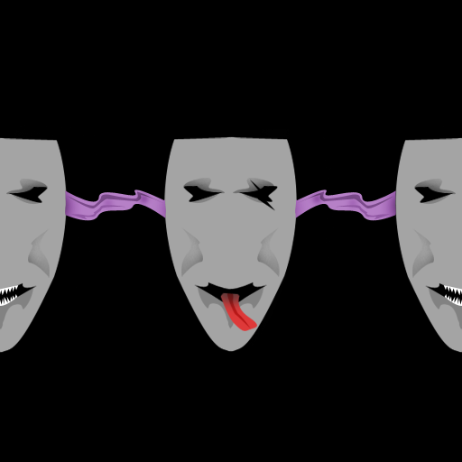
Free head texture I made for Pat0864. Steal it and I will rip off your testicles and eat them with some fava beans and a nice Chianti.
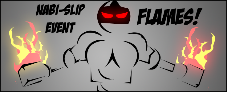
Banner I made for Slip 'cuz I'm his bannerbitch. Pentool and layer styles. Just tryin' out a new style (looks pretty decent imo).
See above.
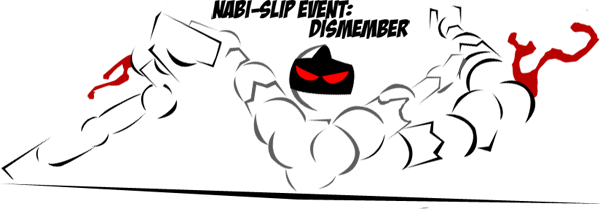
All pentool, dodge/burn and text.
Free head texture I made for Pat0864. Steal it and I will rip off your testicles and eat them with some fava beans and a nice Chianti.
Banner I made for Slip 'cuz I'm his bannerbitch. Pentool and layer styles. Just tryin' out a new style (looks pretty decent imo).
See above.
back from the dead
1. shat brix, insane quality and i nice use of shading/gradients (whichever one you used)
2. Cllean, simple head, although SOME sort of add on to the massive blackness :c
3. Very nice, love the way you did the flames, although i think you should have a bit more under the hands since particles normaly go from all around the body part.
4. Another great one, although i think it feels like it could use more detail or something, i jut can't think of what to add .-.
Over they are all great, love the first one though.
If u don't mind im gonna pick the head and see how it looks in-game , because your head have a very nice quality there.
Simple and clean .
I like the tori a lot up thee even your banners could use some work on the flame though other then that keep up the good work unless you're going to give up on your GFX skills past them down to me xD.
Edit:
I saw the head in-game it looks pretty outstanding
Simple and clean .
I like the tori a lot up thee even your banners could use some work on the flame though other then that keep up the good work unless you're going to give up on your GFX skills past them down to me xD.
Edit:
I saw the head in-game it looks pretty outstanding
Last edited by iNoTo; Jul 14, 2010 at 05:59 AM.
| GATA | Guild Wars 2 | Anime United |

---
1. Awesome job. Good shading. But you forgot about the breast. But still, looking good
[9.8/10.]2. I don't really like it cause the lines are too simple. The tongue is very, very strange. I think that took you not more than 25 minutes. It could have been a great head if you would work more on it. [4/10.]
3. Now that's awesome. But only 1 thing i don't like, the flames. Its just some pen tool work, made one shape,copied it and put it on another with changing the color dodge. Pretty sneaky i should say. And the blurred part is quite strange to me. [8/10.]
4. This one is pretty good too, but the blood is a bit... egh... Well I think you know what I mean. [8/10.]
---
Over all, you can do a lot better, then that, especially to your critique style. I ain't saying that your dumb at art, or even close to that. Maybe you just don't have enough time to work. But you can totally make better than that.
"Philosophy of mankind are pink dreams of a blue planet" ~Lexx
มวยไทย