Original Post


[Tex]Ancient futuristic helmet ? WIP
Soo yeah !
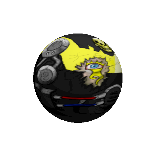
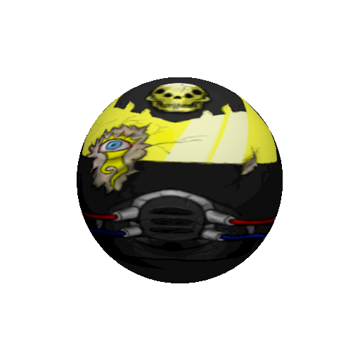
I'm back to texturing.
Here it is.....

To do list:
I'm back to texturing.
Here it is.....
To do list:
- Add shading to the demon parts.
- Add neon-ic Static lines.
- Finalize. Or in other words clean it up.
Last edited by Tengo; Jan 31, 2011 at 01:46 PM.
<Marco> and then Oblivion tried to sexually assault me
<Oblivion> and Marco wasn't surprised at all
<Oblivion> and Marco wasn't surprised at all
What he said.
box.net ftl.
Drawing technique still looks like that of a twelve year old drawing with dirty oil pastels.
porportions look a bit off.
but the structure and detail looks quite nice.
box.net ftl.
Drawing technique still looks like that of a twelve year old drawing with dirty oil pastels.
porportions look a bit off.
but the structure and detail looks quite nice.
-=Art is never finished, only abandoned=-
Originally Posted by Hyde

Apart from criticizing the terribly contradicting name, would it kill you to upload pics to an image hosting site?
Added.
Would it kill you to download a pic ?
Originally Posted by BenDover
What he said.
box.net ftl.
Drawing technique still looks like that of a twelve year old drawing with dirty oil pastels.
porportions look a bit off.
but the structure and detail looks quite nice.
I always like dirty style , I hate making something to be clean.
I don't know why but this is how I see myself different :v
Besides that I just started making art , or getting back to making art in other words.
Thanks any way bro.
<Marco> and then Oblivion tried to sexually assault me
<Oblivion> and Marco wasn't surprised at all
<Oblivion> and Marco wasn't surprised at all
Originally Posted by TengoMan
I always like dirty style , I hate making something to be clean.
dirty is fine, when it looks like it was intentional, but when it looks like bad technique... thats not the look you should be going for.
Ideas on how to correct this:
your black outlines seem to be seeping into the colours around it, which is fine when theyr colours that work together, like reds and blues.
but blending black with yellow, or skin tones, never looks good.
If youre gna use outlines, keep them crisp and defined.
use a different colour for the shadow, the shadow wont always be black, in this case, the visor is yellow, so a darker shade of yellow, orange or even red, for the shadow would work better.
If you think that your work looks too clean after that, find other ways of grunging it up.
more realistic shading would do the same thing
-=Art is never finished, only abandoned=-