

Original Post


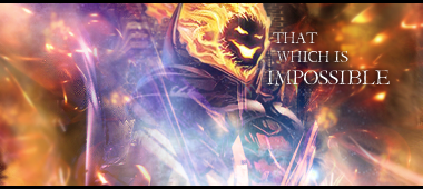

You should try to remove the black bars at the top and bottom, it would probably look better.
Tubby Tubba's Tubby Textures!
Cheap, Decent Cartoon Heads!
Cheap, Decent Cartoon Heads!
Remove text and border. Or remake text with better font.
They both look like shite imo.
And dont even try to say that you dont care what we think. Why you even bother posting this is if you dont care what people think?
Anyway i like 1st one better thou you need to get focal stick out more.
They both look like shite imo.
And dont even try to say that you dont care what we think. Why you even bother posting this is if you dont care what people think?
Anyway i like 1st one better thou you need to get focal stick out more.
It's All About Expansion
I posted this on like 4 forums.
What I meant was, I don't care if you hate it, and I'm not bothered with improvements.
Though, to say I didn't care about responses at all may have been a misphrasing.
But these forums suck anyway. You have to pay for a working img sig.
What I meant was, I don't care if you hate it, and I'm not bothered with improvements.
Though, to say I didn't care about responses at all may have been a misphrasing.
But these forums suck anyway. You have to pay for a working img sig.