

Original Post


[Tex] Lord Vikinwarf the Diligent
Not sure if viking... or just dwarf =.=
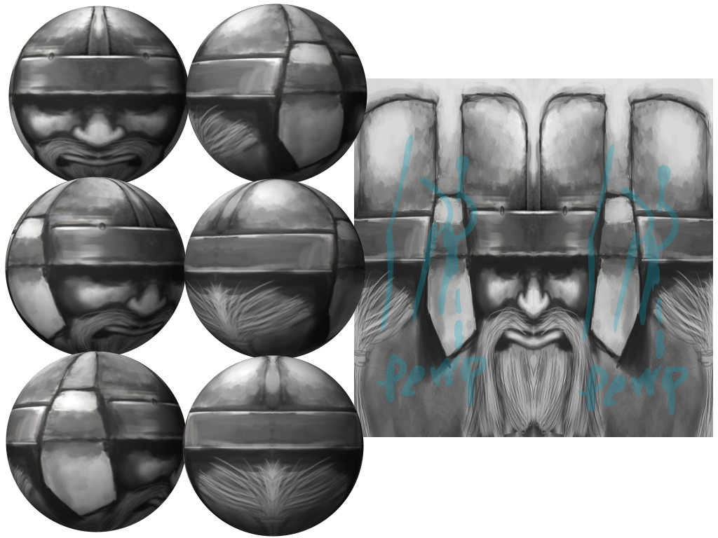
Wip1
Values set.
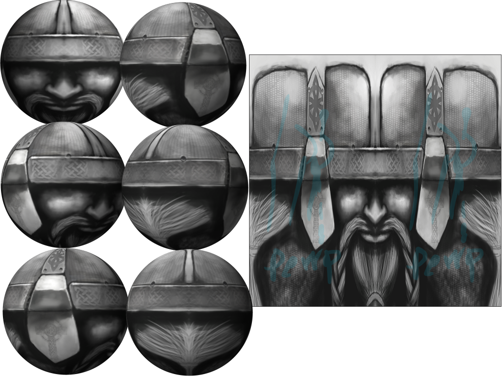
Wip2
Still in mirroring and clean up phase.
Next on my list to do is tidy up, unmirror, then color.
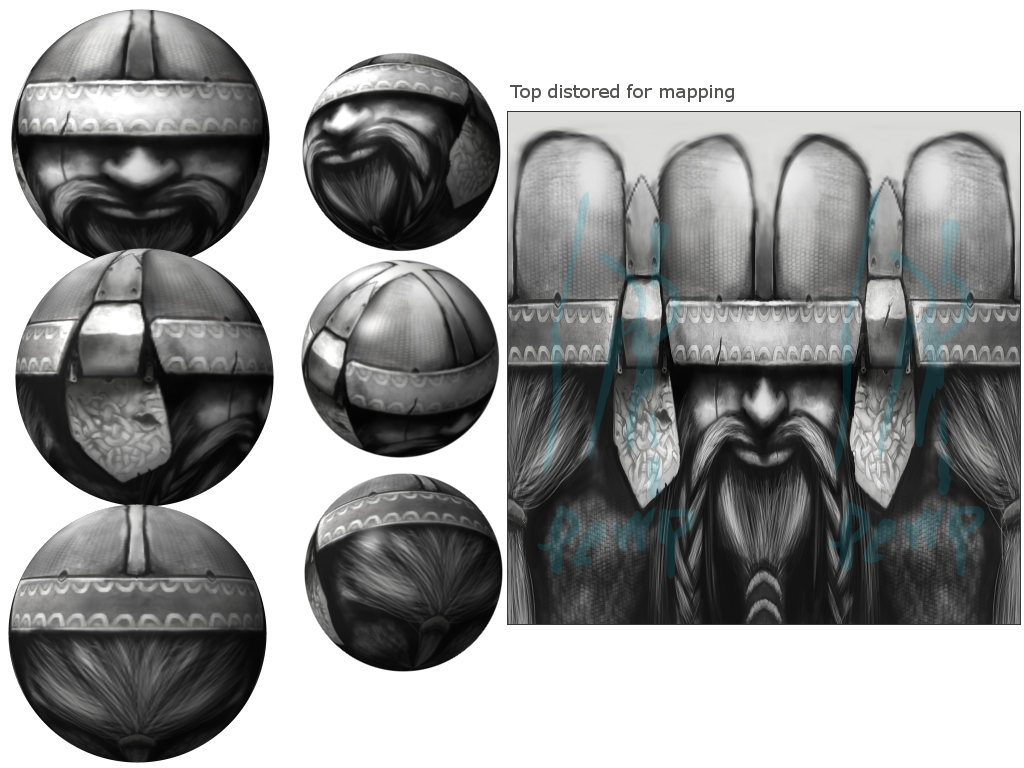
Wip3
Ready for color.
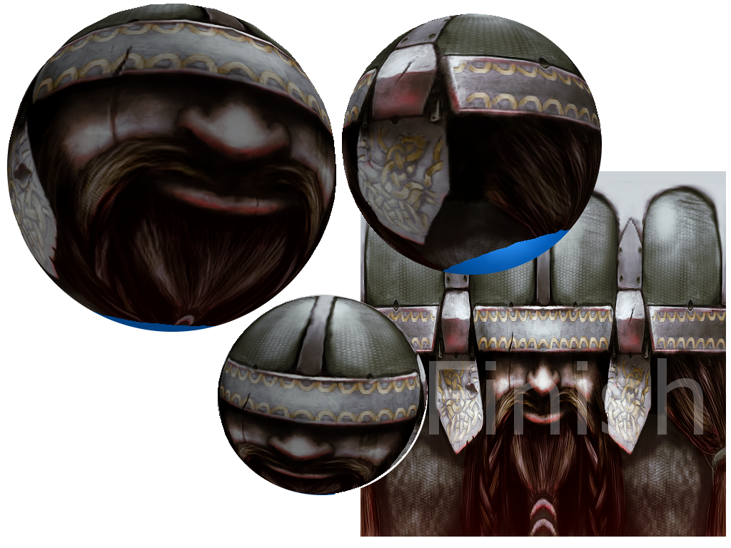
Dun
Wip1
1
Values set.
Wip2
2
Still in mirroring and clean up phase.
Next on my list to do is tidy up, unmirror, then color.
Wip3
3
Ready for color.
Dun
4
Last edited by jusmi; Feb 16, 2013 at 07:05 AM.
Done with this community, you guys suck.


I think you should fix the top and the sides of the helmet, they are a little bit weird, try making it wider and the sides of the helmet, a little bit more separate from each other. Just my opinion
Also his hair and beard almost cant be visible, his face is like a bit too down. Please do not misunderstand me, details are great
Also his hair and beard almost cant be visible, his face is like a bit too down. Please do not misunderstand me, details are great

