


Originally Posted by Sense

Really nice as always man, but could me see it without a pulse in the mouth of the red side, for me it doesn't fit the style but it may look empty otherwise so don't worry if it doesn't look right without the pulse
don't understand what you mean but
Originally Posted by kradoxtb
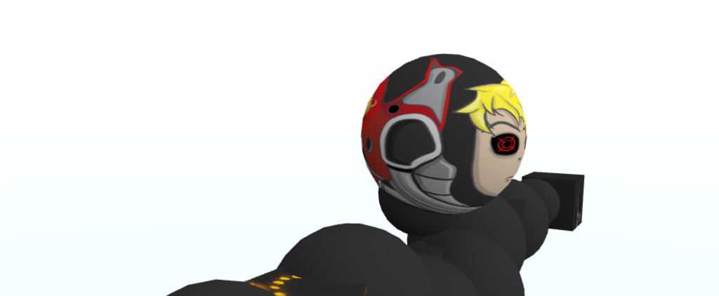
make the left eye with a eye patch no?
oooor make cool sunglasses
the eyes look empty like that :/

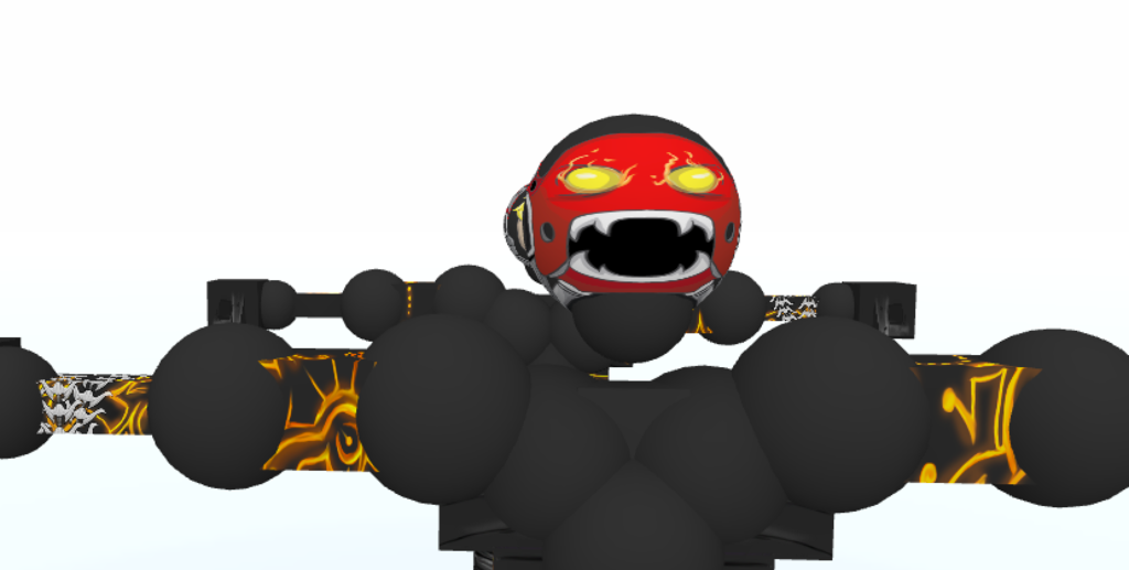
I planned for the face to look as empty/plain as possible, I want people to focus on the mask. :[]
Originally Posted by Odlov
Looks good. I recommend adding something to the front of the head that makes it more obvious that he's wearing a helmet rather than a hijab or something. I'd add a vent or some sort of speakers or something like that.
i tried
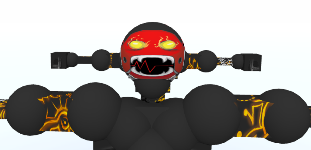
Well, I guess I'm done with the head. Yes, I got lazy, I'm sorry. CnC yaayayayay.
>
Nice twist.
I love the simplicity, I can't wait to see more.
I love the simplicity, I can't wait to see more.
this is anything but simple
i dislike how you went from nice looking eyes, to crappily-made, blacked-out eyes
it could be so much better if you at least took time on them
another problem is how bold the red it
all i can see is that bright red which doesn't look good imo
the idea is great and your art style is appealing to look at, i'm just not content with the color palate
you could mix up a better choice of colors than demon and red
don't talk to me or my dudes ever again

It should have one good looking eye and the cyborg eye should be over to the side with the scar.
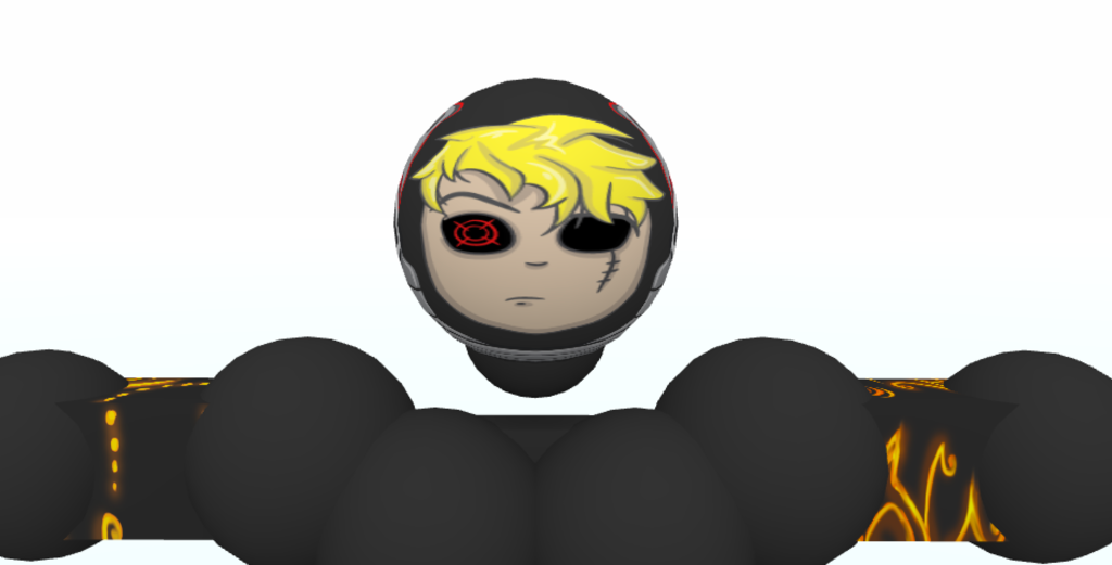
I feel like the hair should be a darker color for some reason
Add a clear visor over his face or a mask over his mouth to help add the helmet affect.
just imo
I feel like the hair should be a darker color for some reason
Add a clear visor over his face or a mask over his mouth to help add the helmet affect.
just imo
[SIGPIC][/SIGPIC]
~ raku ~ Team Girl Scouts ~ Clan League 2013 Champion ~ Duelist ~
Prince
Fucking
Ravioli