


I'll give my real .02 because I think you can take it.
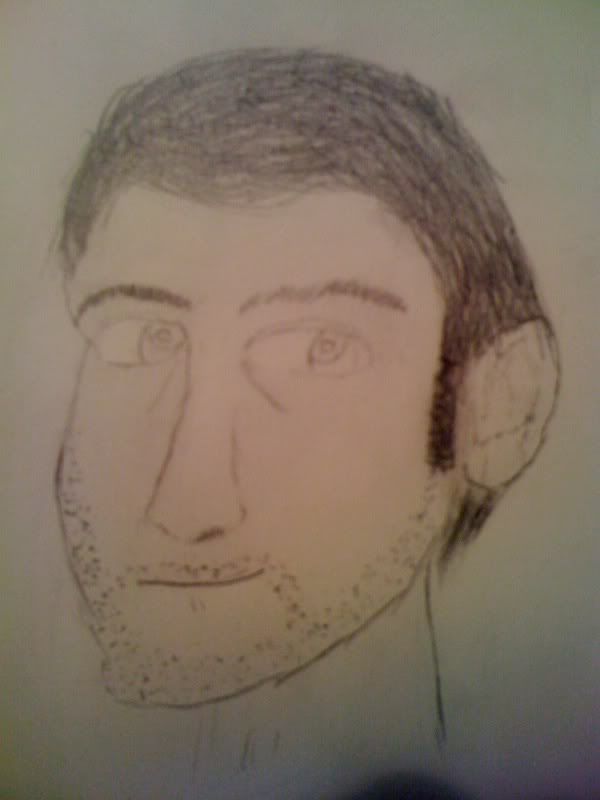
Your self portrait is really flat. Just by adding a small amount of shading a preserving some highlights, and you could really bring some depth to that image. Other than that, your proportion is fairly decent, but your neck is super skinny... maybe it's that way in real life ;)
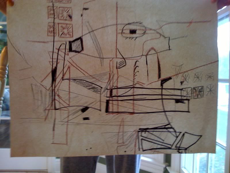
As for the abstract... well, abstract is abstract. However, if you draw to the edge of the page in all areas, it will make the piece feel more complete.
There ya go
Your self portrait is really flat. Just by adding a small amount of shading a preserving some highlights, and you could really bring some depth to that image. Other than that, your proportion is fairly decent, but your neck is super skinny... maybe it's that way in real life ;)
As for the abstract... well, abstract is abstract. However, if you draw to the edge of the page in all areas, it will make the piece feel more complete.
There ya go
Im actully doing a self portrait in art. Its being graded ATM so i will post it when i get it back.
NICE Drawing on the portrait. Mines a little better in my oponion, But still awesome 8/10
NICE Drawing on the portrait. Mines a little better in my oponion, But still awesome 8/10
Want 1k event for doing something easy? check it http://forum.toribash.com/showthread.php?t=129460
