

Original Post


[IMG] Tori Concert
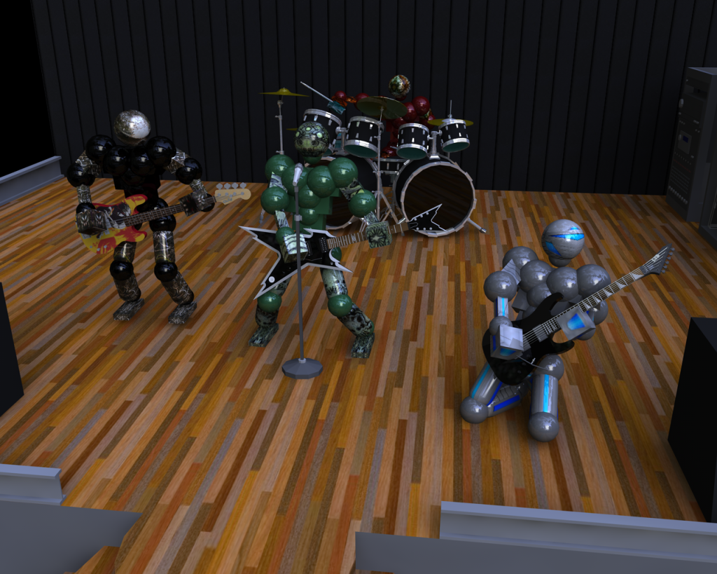
Well GaNz went on tour during daytime because nigh-time doesn't do good for their hdri maps 
All the sets except the robot are for sale BTW
Sets used:
Golem Set By Gleb27 : Drummer
Hopeless Set By Gleb27: Bass
Heretic Set By Gleb27: Rythm Guitar
Project "Platinum" Set By Nasuke : Lead Guitar (Shredding)
All the sets except the robot are for sale BTW
Sets used:
Golem Set By Gleb27 : Drummer
Hopeless Set By Gleb27: Bass
Heretic Set By Gleb27: Rythm Guitar
Project "Platinum" Set By Nasuke : Lead Guitar (Shredding)
Last edited by Nasuke; Feb 25, 2010 at 07:31 PM.
Well, That was amazing, Seriously good job....
Also the microphone is kind of weird looking and stuff,
Another cool add-on would be shadows.
What did you use?
Also the microphone is kind of weird looking and stuff,
Another cool add-on would be shadows.
What did you use?
Cinema 4D and the shadows are very soft due to the hdri map. Adding extra lighting would have messed up everything
