

Original Post


[Art] Jimi Hendrix
so i have started using photoshop again but i am beginning to use different features and try to edit images by my self instead of using the filters
i lack inspiration and the knowledge to make something look good so i use google.
i found this and i thought it would be interesting to edit.
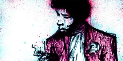
this is the original (a google image)
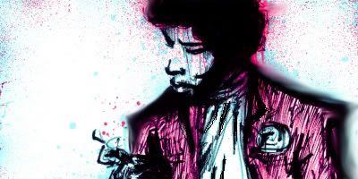
first try
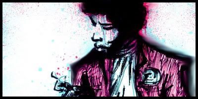
then i made that into my sig
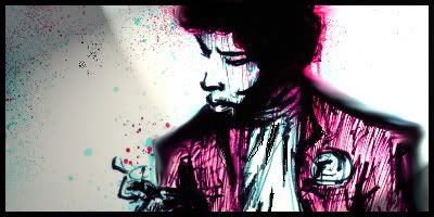
and here is it with a lame attempt at some lighting effects.
i am trying to work with the lighting and i will have an image up in a but i would like to know what i can try to work on or improve on. i would also like to see where i should go from here.
thanks
and please feel free to edit what i have made and show me what to strive towards
i am very sorry if i have broken or missed any rules, please tell me if i have and i will fix it.
i lack inspiration and the knowledge to make something look good so i use google.
i found this and i thought it would be interesting to edit.
this is the original (a google image)
first try
then i made that into my sig
and here is it with a lame attempt at some lighting effects.
i am trying to work with the lighting and i will have an image up in a but i would like to know what i can try to work on or improve on. i would also like to see where i should go from here.
thanks
and please feel free to edit what i have made and show me what to strive towards
i am very sorry if i have broken or missed any rules, please tell me if i have and i will fix it.
Last edited by Toast; Jan 21, 2011 at 01:30 AM.
You made it worse by slapping him in the face with filters and effects.
How rude.
How rude.
Jalis: Freelancer, you're a duck | Sachi: Freelancer, you're a duck | Reanimator: Freelancer, you're a duck
satiknee: Freelancer, you're a duck | Wiggi: Freelancer, you're a duck | Tarlan: Freelancer, you're a duck
satiknee: Freelancer, you're a duck | Wiggi: Freelancer, you're a duck | Tarlan: Freelancer, you're a duck
Unless you took a photo of hendrix and edited it to look like the stock image you used, theres nothing to comment on.
Which you didnt, seeing as you said it was from google, and not even a legit stock image.
The stock image is better than all three of your edits.
And the proportions are wrong. sig is too tall.
Which you didnt, seeing as you said it was from google, and not even a legit stock image.
The stock image is better than all three of your edits.
And the proportions are wrong. sig is too tall.
-=Art is never finished, only abandoned=-
First of all, find a good site for stocks. Try planet renders, deviant art, photobucket, etc.
Next, when you use a stock, you want to transform it not slightly edit it.
You used a premade piece of art basically, you want to take something that hasn't been edited heavily and then go from there.
After that, you want to make sure when you do the sig, the focal point is on the person, thing, w/e
Next too far off to to the side. Also you tried to use a bit of smudging, smudging should be subtle, and elegant.
Use small brushes with different settings for different out comes.
And lighting should always be natural and flowing. Though this piece has none, you should remember that.