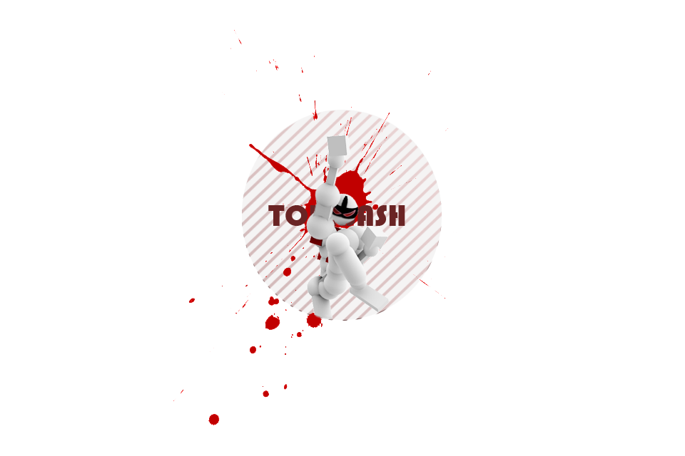
looks nice, but the circle seems to end very suddenly, maybe needs to fade out.
I also think it would be much better if it had his whole body, no leg cut off by the circle.
You seem to have fucked up the layers =/
The blood below Toris leg is in front of the circle but behind his leg.
You add a drop shadow for the circle to get some deptheffect but use the blood like there were no depth. And if you want to make it look like a hole in the white wall (I think that's the reason why his leg is cut off) you had to use inner shadow anyway and not a drop shadow.
4/10
Oblivion: that wasn't hilarious
Oblivion: it was brilliantly complex though
Oblivion: hands down man
Oblivion: today I genuinely believe more than I ever did before
Oblivion: that you are better than me
Oblivion: gg NutHug
I don't like how his leg ends. Also toribash should be somewhere else, I honestly wouldn't have been able to tell it said toribash if i didn't play the game.