

Original Post


[GFX] Sig Blast
works in a long time. I can't seem to find what's wrong in them.
C&C is appreciated.
|Cube | Sphere | Cylinder | Torus|
Youtube channel for the shits and giggles
Youtube channel for the shits and giggles
Oshi the last one is geat, lacks a bit of depth imo.
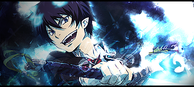
1st one:
Good job with blending but the random blue spots on the hair looks stupid also you should keep the lighting at one side ex. Bottom or Top not both
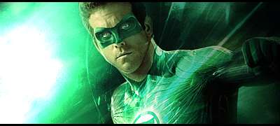
2nd one:
Pretty boring imo.
The render doesnt blend with the bg at all and the render is lq
The lighting is a bit too strong
And get rid of the border
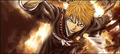
3rd one:
Great job with blending but you need to work on flow
The flow looked good except at the bottom right corner it looks messy
You also chose a bad spot for lighting
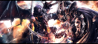
4th
If your going to smudge the bg smudge the edges of the render so it can blend *facepalm
Very messy signature you cant even tell what the renders are doing
Add depth and better lighting and get rid of the border
Good job with blending but the random blue spots on the hair looks stupid also you should keep the lighting at one side ex. Bottom or Top not both
2nd one:
Pretty boring imo.
The render doesnt blend with the bg at all and the render is lq
The lighting is a bit too strong
And get rid of the border
3rd one:
Great job with blending but you need to work on flow
The flow looked good except at the bottom right corner it looks messy
You also chose a bad spot for lighting
4th
If your going to smudge the bg smudge the edges of the render so it can blend *facepalm
Very messy signature you cant even tell what the renders are doing
Add depth and better lighting and get rid of the border
I like doing art and stuff| GATA |... My Deviant Art Http://Riqochaii.Deviantart.com/
Originally Posted by LilTerror

1st one:
Good job with blending but the random blue spots on the hair looks stupid also you should keep the lighting at one side ex. Bottom or Top not both
2nd one:
Pretty boring imo.
The render doesnt blend with the bg at all and the render is lq
The lighting is a bit too strong
And get rid of the border
3rd one:
Great job with blending but you need to work on flow
The flow looked good except at the bottom right corner it looks messy
You also chose a bad spot for lighting
4th
If your going to smudge the bg smudge the edges of the render so it can blend *facepalm
Very messy signature you cant even tell what the renders are doing
Add depth and better lighting and get rid of the border
thanks. really liked this c&c. I'll think about it more when i do my next sigs.
|Cube | Sphere | Cylinder | Torus|
Youtube channel for the shits and giggles
Youtube channel for the shits and giggles