


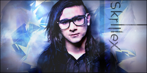

Dislike the background, it lacks depth and doesn't match the color mood on the rest of the picture.
Like the typography though! Great work, except for the "e", looks deformed and out of place.
A bit large for a signature, why are signatures so large nowadays?
Like the typography though! Great work, except for the "e", looks deformed and out of place.
A bit large for a signature, why are signatures so large nowadays?
Jalis: Freelancer, you're a duck | Sachi: Freelancer, you're a duck | Reanimator: Freelancer, you're a duck
satiknee: Freelancer, you're a duck | Wiggi: Freelancer, you're a duck | Tarlan: Freelancer, you're a duck
satiknee: Freelancer, you're a duck | Wiggi: Freelancer, you're a duck | Tarlan: Freelancer, you're a duck
Originally Posted by Freelancer

Dislike the background, it lacks depth and doesn't match the color mood on the rest of the picture.
Like the typography though! Great work, except for the "e", looks deformed and out of place.
A bit large for a signature, why are signatures so large nowadays?
Yeah, i need to work on creating more depth. I will practice that and thanks, i don't have any fancy fonts so i edited that one heavily.
And heres some more typography i created. I made everything from scratch cept the galaxy wallpaper in the back.
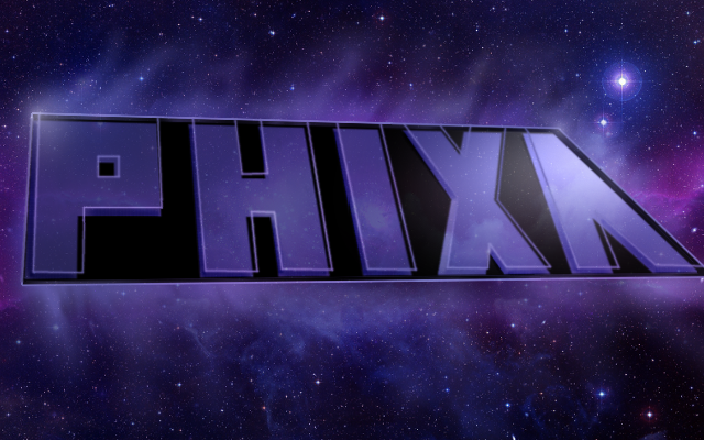
I drew inspiration from Ephixas logo on his youtube page.
Last edited by Phixa; Sep 17, 2011 at 02:17 AM.