

Original Post


[art] Shading experiment
I've been experimenting with shading styles:

How's the new look? Ignore the messy lineart.
Made in PS CS5. Started the sketch yesterday and finished today.
If you want to see more of my art, check out my DA account:
http://gryphoniss.deviantart.com/
How's the new look? Ignore the messy lineart.
Made in PS CS5. Started the sketch yesterday and finished today.
If you want to see more of my art, check out my DA account:
http://gryphoniss.deviantart.com/
Why the hell would you bother to color a sloppily line-arted piece?
If im no mistaken, head is a little big.
Neck is awkwardly turned.
What are the 2 things sticking out his ass? are those feathers?
Legs too aligned imo,especially hind ones.looks like he's missing one (Ignore this if he is)
Still, very very nice.
8/10
-tor1g0d
If im no mistaken, head is a little big.
Neck is awkwardly turned.
What are the 2 things sticking out his ass? are those feathers?
Legs too aligned imo,especially hind ones.looks like he's missing one (Ignore this if he is)
Still, very very nice.
8/10
-tor1g0d
Originally Posted by Dothgar

Why the hell would you bother to color a sloppily line-arted piece?
If im no mistaken, head is a little big.
Neck is awkwardly turned.
What are the 2 things sticking out his ass? are those feathers?
Legs too aligned imo,especially hind ones.looks like he's missing one (Ignore this if he is)
Still, very very nice.
8/10
-tor1g0d
Well, I did say it was a COLORING EXPERIMENT, didn't I? I just wanted to whip something up quickly so I could focus on the coloring, since it takes me a couple of hours to do lineart D:
Yeah, the head is a bit big. I have no clue what you're seeing, but the only thing sticking out of this thing's butt is its tail. I drew the legs like that because it saved time. I didn't feel like shading more limbs, so I left out the other hind limb.
God, I sound like I'm whining, don't I? Well, I just didn't make it super clean and interesting because I was being lazy and wanted to do the bare minimum.
Thanks for the reply XD
Last edited by Gryphon; Apr 22, 2012 at 11:12 AM.
Better than some of your others, but your shading theory is still off.
Also, when you shade, try to use more dominate colors for shading and highlights.
for example, if you have a red-ish mid tone, use a light pink for the high lights and a dark purple-ish red for the shade. That way you have a more detailed pallet then stagnate colors.
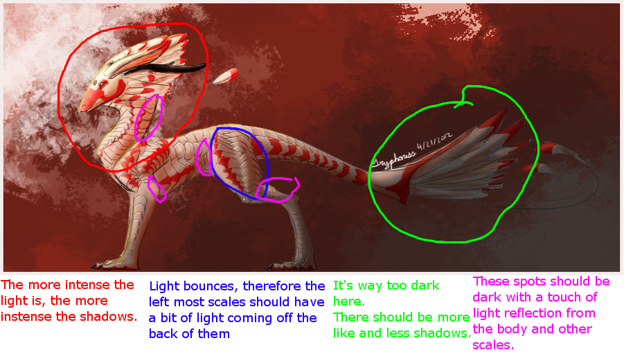
Check this.
Also, when you shade, try to use more dominate colors for shading and highlights.
for example, if you have a red-ish mid tone, use a light pink for the high lights and a dark purple-ish red for the shade. That way you have a more detailed pallet then stagnate colors.
Aka jusmi.
Thanks so much for the red line : D
I've edited it according to your tips:

I've edited it according to your tips: