Original Post


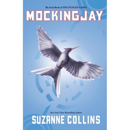
[Art] The Hunger Games, Mockingjay - Suzanne Collins
A poster I made after reading the three books from The Hunger Games series. I just love them...
Made in Adobe Illustrator, tell me what you think...
Print
Љ2012 ~T4mashii - Fenris -Jonar Nicolay Kristensen
Available at: http://t4mashii.deviantart.com/#/d5omjko
Made in Adobe Illustrator, tell me what you think...
Љ2012 ~T4mashii - Fenris -Jonar Nicolay Kristensen
Available at: http://t4mashii.deviantart.com/#/d5omjko
Well, this is pretty dencent, although I disslike the blue you picked..
Blue is too cold.. I guess red would fit more to your object "love", since love was always connected with the color red in my head though ;)
Good job!
Blue is too cold.. I guess red would fit more to your object "love", since love was always connected with the color red in my head though ;)
Good job!
Looks good.
I like the randomness of the text (is it a special font?).
I prefer the color blue , it gives a cold feeling indeed but it looks really good with the white.
Overal it looks quite good.
8/10
I like the randomness of the text (is it a special font?).
I prefer the color blue , it gives a cold feeling indeed but it looks really good with the white.
Overal it looks quite good.
8/10
[SIGPIC][/SIGPIC]
I like it... I have never read the books but seen the movie...  it's a great movie... Any way it is a good piece of art... 7/10 I would change only one thing and that is just using more then only about 3ish colors/shades of colors. I mean you could make the background different shades of blue.
it's a great movie... Any way it is a good piece of art... 7/10 I would change only one thing and that is just using more then only about 3ish colors/shades of colors. I mean you could make the background different shades of blue.