Toribash
Original Post
[Tex] Spot o' tea, Guv'na?
After a bit of a hiatus I thought it could be fun to make an ol' Toribash texture again. But alas I've always been extraordinarily uninspired when it comes to these spherical timbits. So I'm just going to remake one that I tried to make a while back and failed at. I'm also hoping that everyone has long forgotten about my usual green monster theme ; )

Bananas


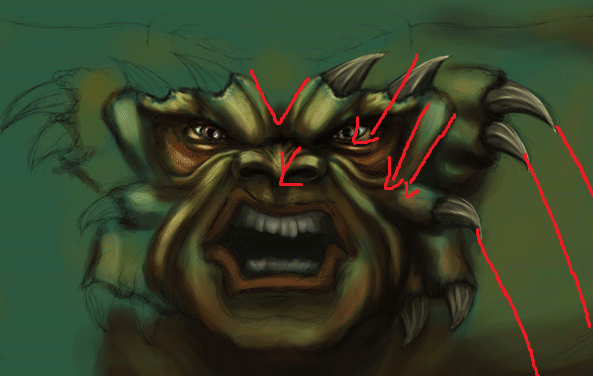
I also just sketched this thing up recently. So any ideas for colors or other nifty things would be helpful.

Oranges

Love it. Both.
Also the first one looks a little bit like hairy hulk. I hate hulk so much, but this one is amazing.
I always loved all your textures, so as always for me it's 10/10.
|Engima|Art|Manga|Anime|
Always amazing work by you, Jebus. Truly amazing but I'd like to see you do work in 512x512 so that you don't lose any details. Lovely shading and color work but this doesn't seem original.
don't talk to me or my dudes ever again
Hahahaha xD luv dem gifs man
Also great job, the head is looking awesome ;) can't wait for finished version
JESUS.

I mean Jebus, this is good.

You probably don't remember me (chacosownr) but I was the annoying kid who wanted a Gandhi/ clone trooper head, and kept changing my mind so you put me on the do not serve list, or Spartan did, I do not recall.

Either way, you have always been my favorite artist, and I hope to see more from you in the very near future.

On to the cnc:

I dislike the horns on the brow for some reason, it seems like an unlikely place for horns to grow, they appear very unnatural (not that green horned beasts are natural at all).

The nostrils seem to be flaring up like an enraged Chimpanzee.

The eyes seem to be too far into the head if you know what I'm saying, almost as if they are under a mask of a green horned beast.

And something I find interesting, is my want for sharp teeth on this monster, the teeth are so dull and un-intimidating compared to the rest of the head.

Hope I helped, and I'm very happy to see you back.
[SIGPIC][/SIGPIC]
love the use of colour to create the depth/shadows.
the horns look nice, but they form too many V shaped elements, theyr like arrows, creating downward lines nd creating an unintentional focal point
its a very common thing around here, too many people mirroring textures without considering the effects
technically theres nothing really wrong with it, its just a bad design choice.
Last edited by BenDover; Aug 21, 2013 at 03:39 PM.
-=Art is never finished, only abandoned=-
Surface looks way too perfect, guess it comes last. Mouth/lips lacks depth and yeh mirroring is bad for your health.
Jalis: Freelancer, you're a duck | Sachi: Freelancer, you're a duck | Reanimator: Freelancer, you're a duck
satiknee: Freelancer, you're a duck | Wiggi: Freelancer, you're a duck | Tarlan: Freelancer, you're a duck
I think you should totally add some highlights to the lips, and that's about it you should do, maybe make the teeth a bit lighter. I mean, I really like that texture so it's really hard to point out all the bad things about it - Nevertheless, it's still a WIP. So we'll see what happens next.

And yes please. I would like a spot o' tea. Mate.