Original Post
[Art] Simple pictures
Hello everyone, Oopyuman here,
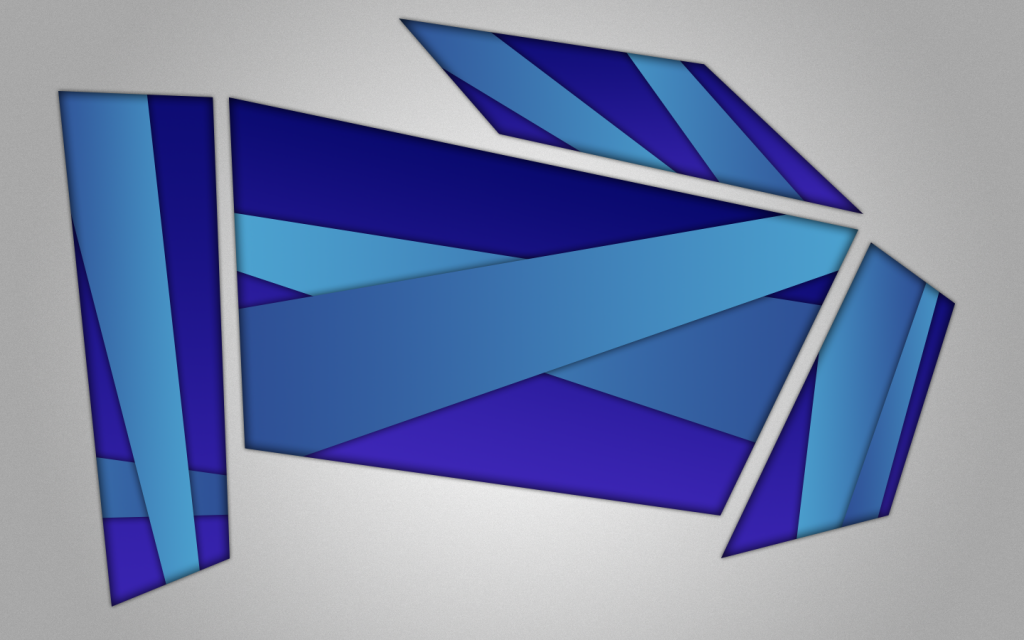
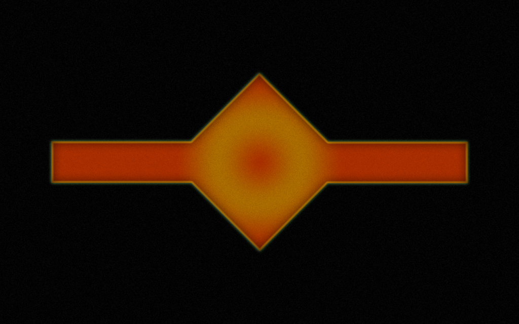
Lately I've been doing these things, they're really simple pictures, and I just don't know if they're good or not, and I was hoping that you guys would tell me that, and if you have any tips on how to improve. Hopefully they're not that bad.
Lately I've been doing these things, they're really simple pictures, and I just don't know if they're good or not, and I was hoping that you guys would tell me that, and if you have any tips on how to improve. Hopefully they're not that bad.
Pics
Thank you for reading, Oopyuman out.
Last edited by Sluup; Oct 5, 2013 at 10:22 PM.
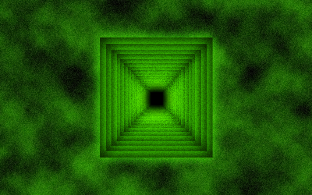
Those are just shapes with drop shadows, this is just shapes slapped on a space and tone added to them. Simple enough, I don't find it sexy or good. Those are just shapes, the green one has a very ugly green-texture overlay, don't do that.
Would be nice if you made a logo, or a simple-looking creature in this. Put some effort you know.
Would be nice if you made a logo, or a simple-looking creature in this. Put some effort you know.
Originally Posted by Metriakon
Those are just shapes with drop shadows, this is just shapes slapped on a space and tone added to them. Simple enough, I don't find it sexy or good. Those are just shapes, the green one has a very ugly green-texture overlay, don't do that.
Would be nice if you made a logo, or a simple-looking creature in this. Put some effort you know.
Obviously you can't read. Just because it's not complex doesn't mean that it has no possibility of being nice. As well, you can't assume that no effort was put into these just because they're simple. Simple things can take very long times as well.
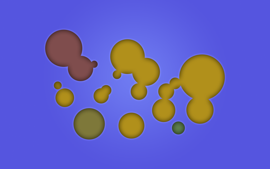
The second one does have a terrible color scheme, and the third one could easily be better.
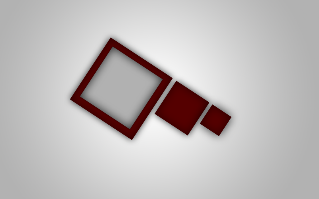
I really like the first one though, I'm not sure why. It just clicks something with me. There's a sort of unity with the picture.
One thing, on the first picture, there appears to be a back light, however you placed shadows which go directly onto the light source, looks kind of weird. If anything, you should have a shadow on the side of the shape facing away from the light, not one on the light, if that makes any sense.
I appreciate the simplicity of the pictures, though i do have some issues with them.
-first one could be a logo, i wish it was.
-second one has a poor color scheme and the concept itself is somewhat bland
-third one reminds me of paint being thrown onto a smooth canvas, or colored bubbles floating, i dont know why, i just like it for what it is. (also the colors dont clash so thats good)
Life is like staring at drying paint. The longer it goes on, the more you want to smash your face in.


