Original Post
[Art] fartsy digital painty things oh man
Giving you fair warning right now, this thread is about me trying to do digital paint, and i'm not very good at it. You may wish to spare your eyes the indignity. :I
Anyways yes, fairly recently i've found a way to do digital painting that actually works acceptably for me. The fact that i'm lazy and inexperienced still remains, but hey, at least i can try to get some experience. These are all done with a tablet (which i love dearly by now, dear god how have i been able to live without such a thing!?).
SO WITHOUT FURTHER ADO
OKAY A LITTLE BIT FURTHER ADO
I INTRODUCE TO YOU MY
EFFORTS
My first legitimate venture into digital painting. He's very crude, as you can see, which is mainly a result of me being lazy and not very good. I also did not aim for accurate anatomy, as evidenced by his eyeball/eyebrow fusion.
---
THE MOST UNEVEN BARREL EVER. The bands are wonky, the top is wonky, the sides aren't equally tall or fat, but hey, it looks somewhat like a barrel anyways. I like barrels. Barrels are my friends.
---
Also a fairly quick and lazy thing, but at least i got the colouring somewhat right. The quick and lazy part is evident when you look at how crude the sunglasses look, and also how the mouth doesn't at all follow the curvature of a sphere. It does, however, accurately depict what i mean when i say B|.
---
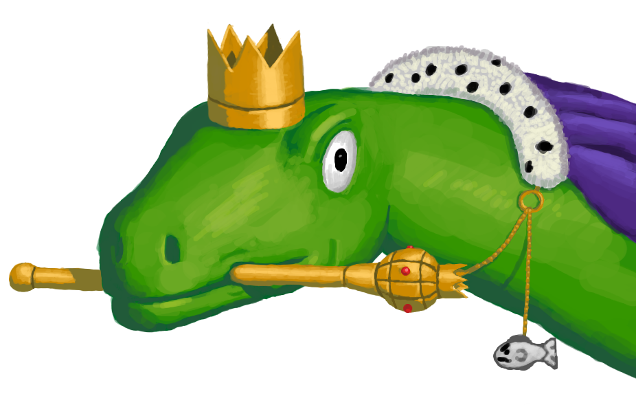
My most recent and definitely also best venture into digital painting, this guy alone took more time than all the others combined, even despite me getting lazy with the cape near the end. It's also painfully clear how bad i am at drawing consistent shapes (see: sceptre ball, sceptre not being straight, crown being all skewed and shit), but ultimately, i am pretty proud of this, if you'll forgive me for being so. Probably took around 4-5 hours in total so yeah.
---
So, what do you think? Critique is welcome, as are tips on how to fix said points of criticism. I'm trying to improve, and it's difficult to do on my own. :I
Addition: I used GIMP for most of these, but have been using Krita as of recently.
Anyways yes, fairly recently i've found a way to do digital painting that actually works acceptably for me. The fact that i'm lazy and inexperienced still remains, but hey, at least i can try to get some experience. These are all done with a tablet (which i love dearly by now, dear god how have i been able to live without such a thing!?).
SO WITHOUT FURTHER ADO
OKAY A LITTLE BIT FURTHER ADO
I INTRODUCE TO YOU MY
EFFORTS
greetings sir
---
BARREL
---
B|
---
KINGLY LIZARD KING
---
So, what do you think? Critique is welcome, as are tips on how to fix said points of criticism. I'm trying to improve, and it's difficult to do on my own. :I
Addition: I used GIMP for most of these, but have been using Krita as of recently.
Last edited by Shook; Jun 9, 2014 at 02:24 PM.
<Blam|Homework> oiubt veubg
various places to find me lol
various places to find me lol
Using another color for shading tends to give the picture as a whole more value, instead of just blackish-yellow, which would deaden it.
On another note, you're certainly showing improvement. For a few of them the brush size seemed to be larger than would be convenient, but I'm just going to assume that's your style. Good work.
On another note, you're certainly showing improvement. For a few of them the brush size seemed to be larger than would be convenient, but I'm just going to assume that's your style. Good work.
Preposterously dank.
Thanks man! And yeah, the large brushes are part of my painty process; start large, finish small. On the faceguy and smiley you can clearly see that i didn't bother going very small, which is once again just me being a lazy turd. :U (KINGLY LIZARD KING is a notable example of me trying to NOT be lazy)
@Dothgar: Pretty much what Nomad said. I like to hue-shift my shadows towards blue, and yellow shifted towards blue becomes greenish. I think. It did here, anyways.
@Dothgar: Pretty much what Nomad said. I like to hue-shift my shadows towards blue, and yellow shifted towards blue becomes greenish. I think. It did here, anyways.
<Blam|Homework> oiubt veubg
various places to find me lol
various places to find me lol
AH GOSSUM MORE QUICK THINGS
I had promised this fine chap a drawing for his birthday earlier, but it wasn't until now he cashed in on it. He desired a red, durpy fish, so that's what i tried to do. As is plainly obvious, i have no fucking idea of how to draw fins, and also kind of rushed it. :I
---
Tried to make a pine cone like SUPER fast. Fast it was (20 minutes woo), but it's also laden with flaws and uglyness. Oh well, was pretty chill to do, despite being an attempt at speedpainting. :U
red fish for RAWWRH
---
maybe a pine cone
<Blam|Homework> oiubt veubg
various places to find me lol
various places to find me lol


