

Original Post


[Art] Let it Clover♣Club
This is my new character Toxic/Dokuseei (Meaning Toxic and is also a side joke for the last name I have, Okuseei.)
Art inspired by the song Clover Club/ Cloba Clubbu sang by Hatsune Miku. If you want, here's the link: http://www.youtube.com/watch?v=m_9pF...5hCMYQ&index=2
--
In case it's not obvious, I kinda copied the atmo of the nightclub in ToriBash.
Here is the shot I used in case you want to see:
--
Credit for some parts goes to my little brother, OmegaDark1, for the following:
Atmo idea
Eye texture
Hair render
--
Programs used:
ToriBash, MMD/MikuMikuDance/MikuMikuMoving, Sai, Google Sketchup
CnC if you want.
This image is 2600x1500 px

Art inspired by the song Clover Club/ Cloba Clubbu sang by Hatsune Miku. If you want, here's the link: http://www.youtube.com/watch?v=m_9pF...5hCMYQ&index=2
--
In case it's not obvious, I kinda copied the atmo of the nightclub in ToriBash.
Here is the shot I used in case you want to see:
This is a reference

--
Credit for some parts goes to my little brother, OmegaDark1, for the following:
Atmo idea
Eye texture
Hair render
--
Programs used:
ToriBash, MMD/MikuMikuDance/MikuMikuMoving, Sai, Google Sketchup
CnC if you want.
Last edited by SweetDevil; Mar 12, 2014 at 07:58 PM.
Love me. Love me. Love me, until you hate me again.
Would you mind sizing it down a little bit so it's easier to cnc? ;o
From what I can see, you did a very good job.
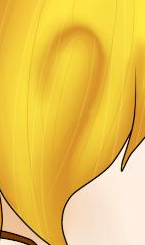
I really liked the hair and the drink.
There were some parts in the shading around the neck, collar, and lower parts of the face that could be fixed. Make the shadows a little stronger.
The eye design didn't look very good in my opinion. Those colors don't mix well. Try doing brown and darker brown. Same thing with blue or green.
From what I can see, you did a very good job.
I really liked the hair and the drink.
There were some parts in the shading around the neck, collar, and lower parts of the face that could be fixed. Make the shadows a little stronger.
The eye design didn't look very good in my opinion. Those colors don't mix well. Try doing brown and darker brown. Same thing with blue or green.
Ryan is Straight {TGS} {Videoer} {Artist} Rip Dog
Irrita,
I'm not a perfect artist. And I could make it smaller but then it'd pixilate. Not a good idea.
About the shading, I can't fix that. My pen tablet is broken so it's hard to do shading. I just use a pen and layer it manually.
The eye design was my brother's idea. All complaints about that should be sent to him!! Hehe. Plus, It's supposed to look like an Easter egg. Because Spring. I don't like using common colors too much, either. My apologies!!
Last edited by SweetDevil; Mar 13, 2014 at 02:23 AM.
Reason: I can't English
Love me. Love me. Love me, until you hate me again.
Ah I see. I guess that some of what I said is more opinion based.
Also, one more thing that I noticed. Her left eye is fairly low on her face, try raising it up a little.
It's a very good drawing, don't get me wrong.
Also, one more thing that I noticed. Her left eye is fairly low on her face, try raising it up a little.
It's a very good drawing, don't get me wrong.
Ryan is Straight {TGS} {Videoer} {Artist} Rip Dog
Yeah, I noticed that. It's not actually her eye, it's her eyebrow! Hehehe! I guess I forgot to edit it and now it looks like the gap there makes the eye look too low. Thank you for the CnC, dude.
Love me. Love me. Love me, until you hate me again.


 .
.