Endurance Onslaught 6.0
Original Post
[Tex] 3AM head texturing


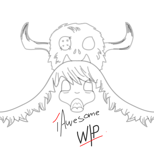
Yes, it's still a WIP.
The title of this is none other than: asadasfa
I was just messing around with the face, end result after 20 minutes or so. Still unsure of what colours I should use nor am I prepared to face the cruel reality that the monster above the head might not look well mapped on the sphere of a tori.

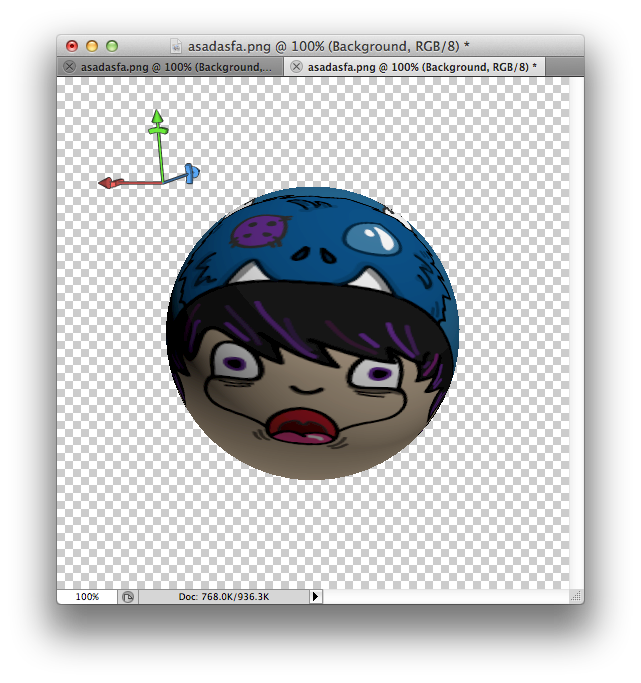
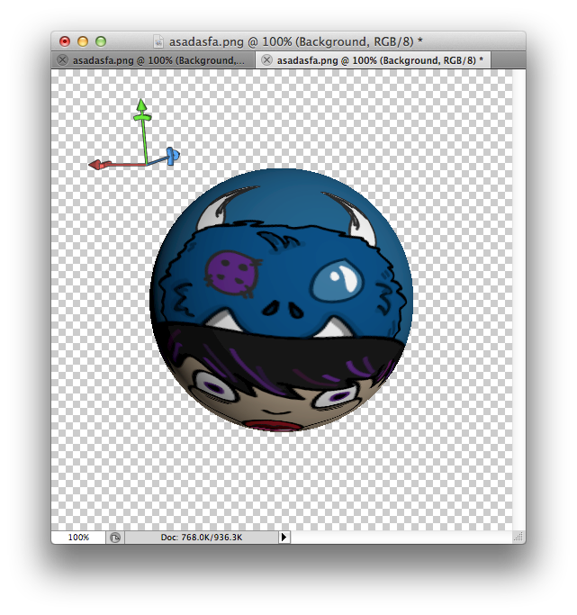
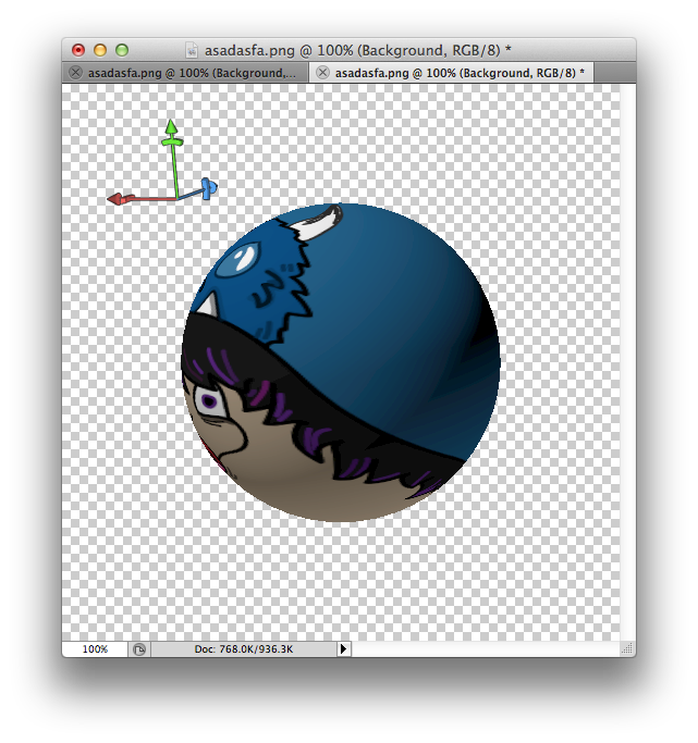
Adobe Illustrator CS5, brush tool
I don't know where this head is going, but, for an interesting concept, maybe have half the head in bright colours, then fading into darker ones on the other side?
[19:59] <Lazors> man it's a good thing people don't see what i write here
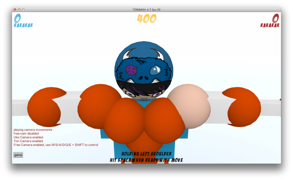
Finished it completely. Badly coloured, I know. I tried asking some to advice me a little but I ended up attempting it on my own. Enjoy!
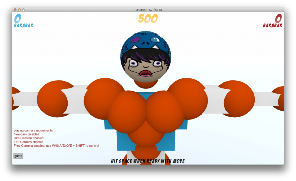
Sphere


In-game

In my opinion I think it's a good head, though it would look better if the mouth was a tad bit bigger, you made the whole hat out of hair and moved the horns farther back and to the side. Good head though.

Need help? PM me!
إد هو العاهرة
Originally Posted by Askijeki View Post
In my opinion I think it's a good head, though it would look better if the mouth was a tad bit bigger, you made the whole hat out of hair and moved the horns farther back and to the side. Good head though.

I find this good too but I think he should lower the hat a little, it seems a little too high since the front is kind of on top of his head
The Smoke Will Never Clear
#LLPS 💙💫
I really liked the concept/wip in the op but was definitely not a fan of how you procceeded.
The horns look pretty bad, I mean:


You use the brush tool too much, as shown above and:


Was thinkin some brown ish colors would fit it way better. The first wip reminded me of forsworn and how great it'd look with those colors.
Last edited by Dinis; Jun 9, 2014 at 09:54 PM.
Originally Posted by Skylarrr View Post
I don't know where this head is going, but, for an interesting concept, maybe have half the head in bright colours, then fading into darker ones on the other side?

You mean shading? I tried. I cried because I failed.

Originally Posted by Askijeki View Post
In my opinion I think it's a good head, though it would look better if the mouth was a tad bit bigger, you made the whole hat out of hair and moved the horns farther back and to the side. Good head though.

Hmmm, I do feel that his mouth is small, I just might alter it. It isn't a head made out of hair though, it's supposed to be a hat but I guess I didn't really make it obvious. Haha, thanks.

Originally Posted by JayXManHD View Post
I find this good too but I think he should lower the hat a little, it seems a little too high since the front is kind of on top of his head

Oh, I made the hat like this. It's a surprise to other users when the person tilts their head downwards. Thanks though.

Originally Posted by Dinis View Post
I really liked the concept/wip in the op but was definitely not a fan of how you procceeded.
The horns look pretty bad, I mean:


You use the brush tool too much, as shown above and:


Was thinkin some brown ish colors would fit it way better. The first wip reminded me of forsworn and how great it'd look with those colors.

Looks like someone plays Skyrim, I have no idea which one of them is Forsworn though. I completely agree with you that I overused the brush tool, trying to get used to drawing on my tablet. I thought the horns looked okay, this was the fourth time I shaped it. Thanks for noticing the things above, Dinis. Pretty avatar you have there by the way.
I think you need to add more dimension to the
'monster' on the hat. It looks too flat.
The past makes you wanna die out of regret, and future makes you depressed out of anxiety. So by elimination, the present is likely the happiest time.