

Original Post


[TEX] Abstract Eye
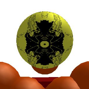
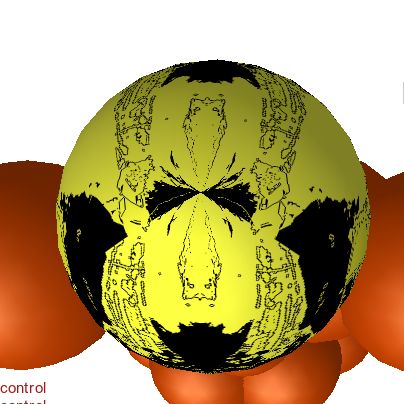
This is a 512x512 head texture that I've spend some time working on in Photoshop. Originally, I accidentally stumbled across the technique I used to make it, I was just fiddling around with filters and how they worked together...then I found a cool combination of filters and started working with them. And so, I started drawing and applying my newfound technique.
So...for a simple abstract head, what do you think? I was going for a general eye shape using the whole head, but without going into too much detail.
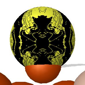
It's not quite complete, I still plan on adding something to the very center on the back to fill that little void area...but other than that, I like to keep things symmetrical and single.
I was just wondering if anyone else liked the art style on it other than myself, and if there's any suggestions of things to add, feel free to tell me. Thank you for your time!
So...for a simple abstract head, what do you think? I was going for a general eye shape using the whole head, but without going into too much detail.
Front
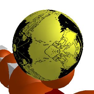
Right
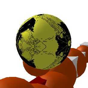
Left
Back
Top
It's not quite complete, I still plan on adding something to the very center on the back to fill that little void area...but other than that, I like to keep things symmetrical and single.
I was just wondering if anyone else liked the art style on it other than myself, and if there's any suggestions of things to add, feel free to tell me. Thank you for your time!
i feel like "abstract" is just an excuse for some people to call it something that it looks literally nothing like the art
i cant see how this is an eye at all
i cant see how this is an eye at all
Originally Posted by Kaneki333

I'm Brazilian, i'm alredy fucked every day i wake up
Existential...people like you make the Toribash community just suck.
I've never used Gimp before and this isn't some 2 filters that were rag-tagged together.
Tyzi, I appreciate you at least stating an opinion that was slightly helpful. Basically, abstract doesn't appeal to everyone, it's a rather specific art style, and if you don't like it or get it, that's not a problem. Thanks for the input.
You just have to ignore the people that don't try to help at all.
I think it looks cool, a neat outcome from using filters. Using filters and making random/abstract things stretches your experience and there is nothing wrong with that, filters used carefully can make textures even better.
I would try to add in some manual work to see how that turns out. The color is a bit bright, so I would try to pick a cooler color like a light blue or a nice soft green. If those don't look right to you there are some warmer colors like red or orange are always options.
Good luck with finishing the texture, I hope to see more from you. :)
8-)
Using filters isn't art.
This is art.

Now if you really want cnc.
Stop using filters.
and actually make something with your own two hands.
Draw it out, you're never going to get good if you use filters, even if you didn't use filters this is atrocious.
This is art.
Now if you really want cnc.
Stop using filters.
and actually make something with your own two hands.
Draw it out, you're never going to get good if you use filters, even if you didn't use filters this is atrocious.