

Original Post


[TEX] CnC needed. Attempt at realism
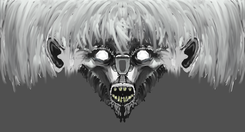
Wip 8 is here and its ugly D:
I did take the grey/white sketch thing from jebus by the way, but it will end up in color and detailed, tell me what you think (I'm still really rusty so this kinda sucks):
[SPOILER="Earlier Wips"][URL=http://s300.photobucket.com/user/Veoo/media/Attempt%20at%20realistic%202_zpsgkpptanj.png.html]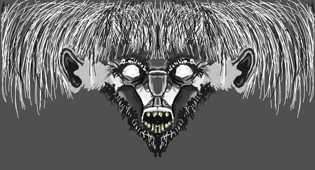
[URL=http://s300.photobucket.com/user/Veoo/media/head%202_zps1tngyevg.png.html]
WIPS ABOVE THIS ARE NOW NOT AVAILABLE
I did take the grey/white sketch thing from jebus by the way, but it will end up in color and detailed, tell me what you think (I'm still really rusty so this kinda sucks):
[SPOILER="Earlier Wips"][URL=http://s300.photobucket.com/user/Veoo/media/Attempt%20at%20realistic%202_zpsgkpptanj.png.html]


[URL=http://s300.photobucket.com/user/Veoo/media/head%202_zps1tngyevg.png.html]
WIPS ABOVE THIS ARE NOW NOT AVAILABLE
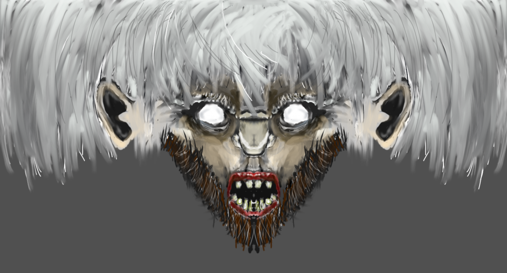
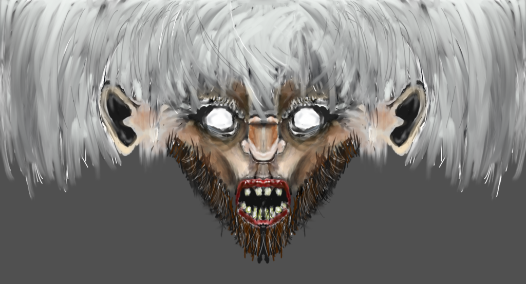
Current WIP (9th)
Last edited by Veoo; Jan 11, 2016 at 12:31 AM.
 10/10
10/10
Originally Posted by Cerberus

no offense but... meh.... You're using a hard round brush all the time, doesn't look that good
asshole.
Jk lol.
But what brush do you recommend?
(also its just a sketch)
-----
Also: if you have a problem with my texture and don't know a proper solution, please don't post on my thread, unless you can at least try to find some sort of solution that I could implement, constructive criticism is what I ask for, not just criticism
Last edited by Veoo; Dec 30, 2015 at 07:10 PM.
Reason: <24 hour edit/bump

